-
When you click on links to various merchants on this site and make a purchase, this can result in this site earning a commission. Affiliate programs and affiliations include, but are not limited to, the eBay Partner Network.


Carlo M
-
Posts
446 -
Joined
-
Last visited
Content Type
Forums
CGC Journals
Gallery
Events
Store
Everything posted by Carlo M
-
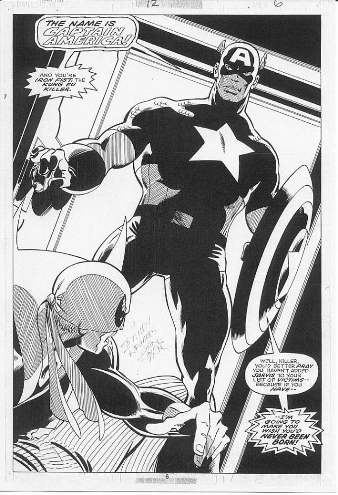
I think those price levels refer more to the red costume materials. Somehow the earlier issues with the Yellow costume seem to command lower slightly prices, even though they are (reportedly) Wood pencils as opposed to Powell / Wood.
-
See my eralier post, which I transcribe here: I have a bit of a vested interest, yet I found very suprising that both Sal's Cap and Kane's Thor covers ended up higher than the Avengers cover by Kirby. I wonder if this is due to i) good quality of the Buscema and Kane covers (both really good IMHO), ii) a bit of fatigue by Kirby investors after the Cap cover and the FF Annual stuff, and given the Silver Surfer pin-up coming right after (excellent piece, congratulations to the buyer?), iii) the Avengers cover not being from a peak Kirby period. I guess a combination of all the above is probably the right answer
-
I have a bit of a vested interest, yet I found very suprising that both Sal's Cap and Kane's Thor covers ended up higher than the Avengers cover by Kirby. I wonder if this is due to i) good quality of the Buscema and Kane covers (both really good IMHO), ii) a bit of fatigue by Kirby investors after the Cap cover and the FF Annual stuff, and given the Silver Surfer pin-up coming right after (excellent piece, congratulations to the buyer?), iii) the Avengers cover not being from a peak Kirby period. I guess a combination of all the above is probably the right answer.
-
Apart from a few very specific pages that carry a very strong emotional value for me (for example, Hulk 206 and 207 splashes with the Defenders by dream team Buscema Staton or Defenders 50 DPS by Giffen): - A killer Kirby (ideally Kirby Sinnott) - A strong interior by Perez from his '70s run on the Avengers (ideally Marcos inks) - An interior by Starlin from '70s Captain Marvel or Warlock - A Silvestri cover from his X-Men run from the '80s Perez Avengers is particularly difficult as his stuff from that run seems to be quite concentrated in some collections...
-
The most blatant example is the X-Men. Cockrum and Byrne pages with Wolverine or Phoenix have been 60%-100% higher than comparable pages without. And the same would apply to the runs of the,likes of Romita Jr, Smith, Silvestri and Lee. For team books, it is generally multiple characters or key characters within the team (like Cap or Iron Man for the Avengers of Hulk for the Defenders) as opposed to pages with second tier or single characters displayed on the pages. This can represent an opportunity. For example, vintage Iron Fist pages by Byrne are super high quality and are a fraction of the price of X-Men pages (not a small fraction any longer, I am afraid). But you have to compare production from the same period. Saying that Byrne Uncanny is higher than byrne WCA just because of a difference in characters makes no sense, as they come from very different eras..
-
WTB Tradd Moore Silver Surfer Black pages
Carlo M replied to Silveriderpanther's topic in Original Comic Art Marketplace
I also tried but at one minute into the sale the item I asked for was already sold. The wole thing sold out I believe in a matter o fminutes. And prices were quite full! Congratulations to Felix and Tradd for a very successful sale! And very good news for the state of our hobby! -
I am not a Wrightson expert but I am also in the camp "lots of detail does not necessarily = great art". And that applies to comic and other art equally. Having said that, this particular piece is quite spectacular, and in this case the detail provided is probably instrumental to convey and enforce the obsession of the characters and the drama of the situation. In other cases, detail is totally gratuitous and...just not for me...
-
Sal Cap at the moment ahead of Starlin Cap Marvel and Kane Thor....we'll see.... (mind you, me loves Kane and Starlin covers.....)
-
Plus one
-
To turn the argument around here are some PROS of splashes: - As interior, they can have more refined inks, with more nuances that normally are not included in covers - Some splashes that are not title splashes can actually have a larger image. To examples below. - Comparing similar relative quality (ie A cover vs A splash), splashes typically would be 1/3 the price of a cover - Almost as rare, as there are 1-2 splashes per issue CONS - Have great variance in quality - They don't have the PROS of the covers...
-
Did not meet my overall goal to restrain myself...but I did make progress on a few other fronts : - upgrade Silvestri Inferno UXM - first Marvel large art from Silver Age - add one more prime page from all-time run / artist favourite (UXM Byrne) - get one example of Davis Excalibur (hopefully arriving over the next few days) And I am afraid the November Heritage will present a couple more temptations....
-
Silver Surfer Black #3 Original Art Edition Volume
Carlo M replied to dichotomy's topic in Original Comic Art
For a moment there I thought the art was glued on the pages....fortunately a carefully read of the description dispelled the holy terror that had posessed me . Great great contemporary and yet timeless art -
I am not a big Sienkiewicz fan, I find his art often too cerebral. But these pages are beautiful! Anybody knows if the buyer is a dealer and might break up the book ?
-
I have just sent an email to Heritage asking them to provide also the date of the inks in the description. The consignor should know and should be willing to disclose it. Let's see...
-
Excellent detective work! Now the last piece of info that I think Heritage should provide is when Sinnott did the inks on the page up for auction. The description vaguely says "later". If I were a bidder I would be (marginally) interested in knowing whether the whole piece is vintage 1978 or pencils 1978 and inks - say - commissioned specifically to put the piece up for this auction. It might have an impact on perception of value upon resale.
-
Makes sense - the poster AND the back cover of the Masterworks book look the same and slightly different from the HA auction. But it is important to know that there is only one penciled version and that that is the one which is being auctioned. Strictly speaking it is not "published". Oh well it is just semantics, is it not? It does look spectacular. On a a separate but related topic, Avengers 158 cover is up! One of the best covers Kirby did for Marvel in the '70s, possibly second only to FF200, IMHO. Thoughts on final hammer price?
-
Not a big fan. I find the ones with two different characters and storylines dilutive and with far less impact than - say - a unitary splash. A case of one plus one equals less than two. The ones that portait four different moments of the interior story (like FF 106) are more acceptable but still distracting. Call me silly but I would prefer paying a fraction and getting a strong interior with strong storytelling. My 2 cents.
-
Thank you all for the various contributions. It looks like Lichtenstein (and other similar artists as well) has too much uncertainty about replicates for me to go into right now. I will need to do more research. His stuff looks really good but shelling out USD50k for something of which I do not know exactly how many copies there are and in which form does not look like a good idea. On one comment I agree though. Comic art has been fantastically liquid, at least vintage OA. Every time I have decided to monetise, it has been extremely easy and has come at values on average in line with expectations. However, I have almost always lost money on contemporary comic OA, so I am not sure I would qualify it as "liquid". I would also not underestimate the logistics: OA is extremely easy to ship around, which would not necessarily be the case with art on canvas or similar mediums. That is definitely a plus vs painted fine arts.
-
I certainly feel out of my league here. The gallery rep described the piece as a "one of a kind" litograph - but I saw three having sold on HA in the last few years! Same image! I will need to do a lot of work...
-
This might be off topic and might have been covered before. I was strolling around in my lunch break today and walked by a contemporary art gallery I had never noticed before that had a few Lichtensteins . One in particular caught my fancy so I enquired a bit about it. Unique litopgraph featuring a nice close up of female character. Vey classic Lichtestein, produced in the '60s. Size a bit larger than a DPS. Price around 50k USD, so basically in line with some strong super heroes covers from the '70s. I found it very striking, with a visual impact on par if not superior to my best OA. This got me into thinking ...should I branch out into more mainstream pop art? So I wonder, are people on this board exclusive to OA? Are some of us considering or already pursuing other art investments, that might be less emotionally connected but a bit safer in the longer term? And how do the two collecting experiences compare? How does a litograph by a major widely recognised artist fare in your eyes versus the best, hand pencilled splash by somebody who is known only to us? Carlo ps - any experts in things Lichtenstein please send me a PM, would like to ask a couple of things
-
Agree 100%. Marvel is milking some characters with c***p. Yesterday night I just could not finish the latest Old Man Logan issue , which is the nth reboot of the nth version of the character...and I was like why have I bought this s**+t anyway. I hope they will not do the same with House of X...finally some X-books that are readable.
-
Favorite image from your favorite artist
Carlo M replied to gumbydarnit's topic in Original Comic Art
Hold on, thread is "favourite page by favourite artist", right? (but we have to admit the image (and its price tag) is not a meaningless one) -
As I mentioned in the past, I have bought from them, albeit very occasionally and mostly in the distant past. I think there is no harm in trying. If the piece is niche enough, with a market value which is a bit uncertain, maybe just maybe they might quote a price which inolves a premium you are willing to pay. Chances are very slim, but in all honesty they have always been quite personable in my dealings with them, so I can't see any real downside in asking. Based on the commentary above, however, I would be very careful with unpublished work, stuff with acetates layers, pasted logoes etc.
-
Neal charged me USD800 for this commission last year at Lake Como. Admittedly, he did it overnight. This is one of the two pieces in my collection I have not posted on CAF, for totally different reasons.....

-
Interesting legal nuisance , but in a way makes sense


