-
When you click on links to various merchants on this site and make a purchase, this can result in this site earning a commission. Affiliate programs and affiliations include, but are not limited to, the eBay Partner Network.


DeliBebek
-
Posts
2,284 -
Joined
-
Last visited
Content Type
Forums
CGC Journals
Gallery
Events
Store
Posts posted by DeliBebek
-
-
They should have used that look for Northstar, not Quicksilver. It's still a super-speed character with an unseen super-powered sister. Fast-flying scenes are easier than fast-running scenes, aren't they? The look of the character in the movie would work better for the character they didn't use, in my opinion.
And Singer is "franchise creator?" I understand he directed the first two, but it's a bit misleading for those who don't recognize the distinction in the use of the word "creator" in that context. "Director" is enough, really.
-
I like the style. I think Ramos' work looks better in sketch. It has a fresh, dynamic quality that doesn't always show in the printed product.Here's mine... My first book!!!
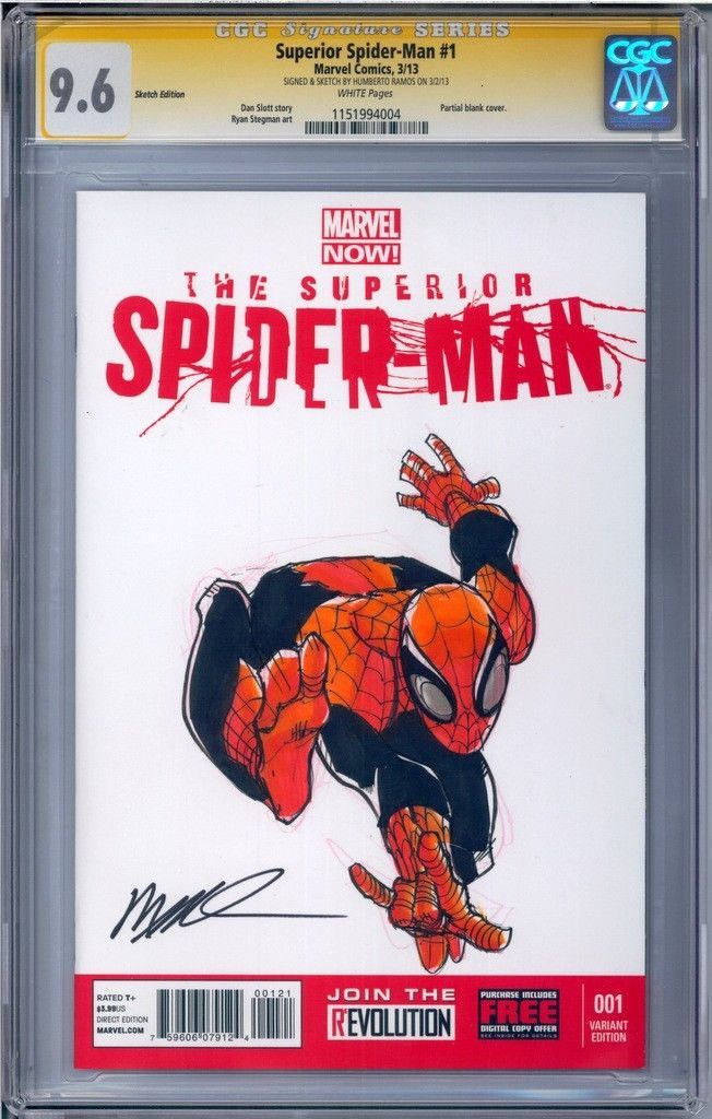
That said, what are the two lumps beneath Spider-Man's right hand?
-
They recycled cover gags for several issues in a row, from about issue 66 up to 73. In fact, issue 68 is a rework of the cover for 29 you posted. In issue 62, they redrew a -script from issue 4 (and the story was later redrawn again with minor -script changes in That Wilkin Boy)And this one I just find amusing. I mean, it's a classic Jughead #1 cover … I just think it's odd how quickly it was recycled. Only 68 issues later? I've seen it across different books in the Archie series for sure, and I get it, with over 100 Archie/MLJ titles spanning roughly 75 years you're gonna see some similar concepts. But the same cover, same title, so soon is intriguing to me. Same or similar Archie/MLJ covers could make for a cool thread.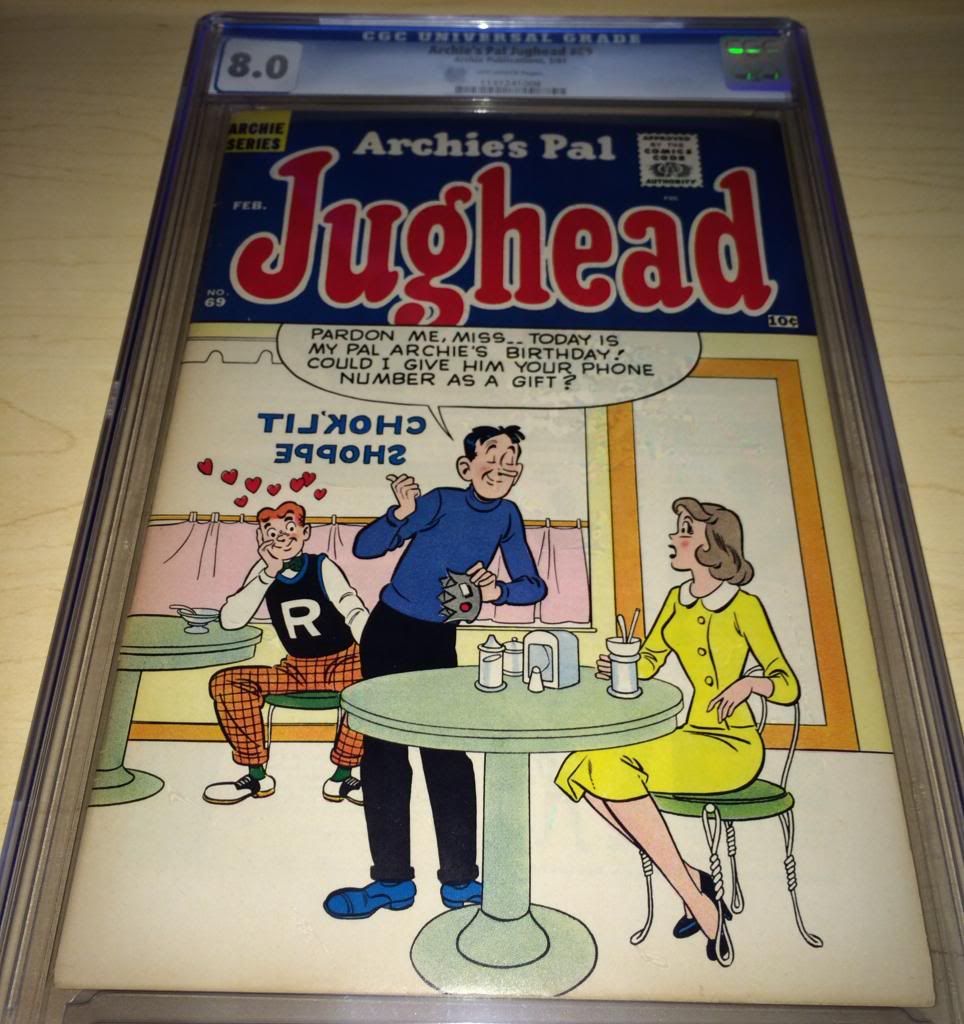
I'd like to say Samm's takes on the cover gags were superior to the originals, but he really didn't change much of the design or look of it. As much as I love his interior work, his covers rarely catch my attention the same way.
-
That's really not a bad Bill Vigoda cover either. I don't like his later stuff, but this one has charm.Been trying to pick up copies of some of the best GGA covers from Archie.It's no Archie 50, but Archie 53 has it's own Betty on a couch cover.

-
Does this mean Giant-Size X-Men #1 is suddenly going to get hot? I should get one of those, for posterity.
-
Exactly. Plot optional.
Exactly what I thought on reading the article. We've seen what Liefeld puts out when it's a high profile opportunity to redeem himself as a writer and an artist. If he thinks it's great, it makes one wonder what it's really like. It strikes me odd that he's referring to what the film is about, rather than what the screenplay is about. Having a screenplay doesn't equate to the film being made, and even if it is, it will likely bear no resemblance to the screenplay he has read.I would probably be more interested if Liefeld thought the -script sucked…But that may clue you into the level of detail Liefeld goes to when reading something.
"Cable's in the -script? Check.
Deadpool's in the -script? Check.
THIS IS A GREAT -script!"
-
I was hoping it would be this X-Force:
My favorite run on X-Force was the John Francis Moore run with artists Adam Pollina and Jim Cheung. I don't think anything about that run would translate well to a movie.…I will only go see an X-Force movie if it's the Milligan/Allred era X-Force and Doop is in it.
It would be kind of cool to see little tributes to Liefeld in an X-Force movie, such as the occasional obvious hiding of feet and pouches in the least convenient places.I heard they're having trouble finding enough actors who don't have feet. -
Exactly what I thought on reading the article. We've seen what Liefeld puts out when it's a high profile opportunity to redeem himself as a writer and an artist. If he thinks it's great, it makes one wonder what it's really like. It strikes me odd that he's referring to what the film is about, rather than what the screenplay is about. Having a screenplay doesn't equate to the film being made, and even if it is, it will likely bear no resemblance to the screenplay he has read.I would probably be more interested if Liefeld thought the -script sucked… -
So many stories with Mr. Lodge, so few with Mrs. Lodge. There is a long history of minor characters in the Archie Universe who never really get their time.This is my favorite of the few that I have:
I like the word play, but it's really made by the sound effect drawing attention to the time. Then again, the time isn't really indicated correctly, but we get the point anyway.
-
Spirit, Steranko, Schomburg and Silver Age Marvels all start with S, so there's nothing schizophrenic about it. It's perfectly collectorish.Hi guys, I'm Tim and I'm a bit of a collecting schizophrenic. I collect Spirit Sections, Steranko Covers, Schomburg Covers, and early silver age Marvels. Glad to be here! -
My name is not DeliBebek and I am a Board-aholic.
-
Nice copies. The "Samurai Combat" billed on the cover of issue 2 is a Goodwin/Simonson work. Such promising stuff from the short-lived Seaboard.

-
I know the label says Neal Adams, and GCD says it's Neal Adams with Giordano inks, but this must be one of the lamest Neal Adams covers ever. I don't say that to disrespect the comic or the purchase, because it's great to have one of the 100-pg giants in great condition. Maybe the cover was drawn by someone in Neal's studio, and Neal got the art credit for it. Usually, Neal would make even such a static cover seem like there was action. Plus, I don't see a signature anywhere on the front or back. There's a character map on the inside front. Does that indicate it was drawn by Neal?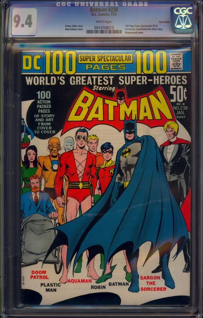 The discoloration on the cape is external on the case (whew). I hadn't expected one of the three 9.4's to ever become available, and had resigned myself to the 9.2 (Greggy's old under-copy when he upgraded to one of the other 9.4).
 -
Faithful comic book movies must include resurrections and retcons. They've already got the reboot business going on.They only killed him once -
This is one of the reasons I spent a little extra on a large format 3-in-1 printer (not terribly large, but 13x19). I can print them out at two to three times the original size if I care to. It's good for scanning and printing most original art for display as well.
Or you could scan the books and make a copy of the covers on your printer and safely store your books in a comic box.Well it's not a comic room yet, but I will be hanging some of my favourite comics soon. First bit of the process, put them in frames:
These are just clip frames at the minute, I may upgrade later. Anyone ever have any problems hanging books like this? I can't see there would be any more pressure on the comics than if they were in a stack?
Cheers
But what do I know?
Amen! I can't understand using the actual comic,it's just damaging the book.

-
And is it a Joe Edwards cover?
Very cool - is this one a price variant?
-
It's a tough call, the first appearance or the first feature story. I feel drawn to the latter.(5) Four Color 386178

-
I mean Marvel Premiere 15. Sorry. There were actually two Marvel Feature series, though. The second one was all Red Sonja, but still only 7 issues. The ironic thing is I accidentally typed Marvel Premiere on the first Marvel Feature but realized that was wrong.(1) Cerebus 1(2) Giant-Size X-Men 1
(3) Marvel Feature 1
(4) Conan 23
(5) Marvel Feature 15
(thumbs u
(1) Cerebus 1(2) Giant-Size X-Men 1
(3) Marvel Feature 1
(4) Conan 23
(5) Marvel Feature 15
Series ended at #12…
-
I know we've had this conversation before, but it's highly entertaining. Me and some of the fellas got into a debate a while back in the SA threads and was thinking about it today.
A simpler version of the conversation would be for YOU to identify the TOP FIVE keys according to YOU by ERA.
So, what are the TOP FIVE keys from each era YOU would want in YOUR collection?
Golden
(1) All-American Comics 16
(2) Mad 1
(3) Mystery Men Comics 1
(4) Pep Comics 22
(5) Four Color 386
Silver
(1) Adventure Comics 247
(2) Avengers 1
(3) Zap Comix 1
(4) Tales of Suspense 57
(5) Harvey Hits 3
Bronze
(1) Cerebus 1
(2) Giant-Size X-Men 1
(3) Marvel Feature 1
(4) Conan 23
(5) Marvel Premiere 15
Copper
(1) Bone 1
(2) Ronin 1
(3) Saga of the Swamp Thing 20
(4) Thor 337
(5) Albedo Anthropomorphics 2
Modern
(1) Y: The Last Man 1
(2) Invincible 1
(3) Kingdom Come
(4) Planetary 1
(5) Civil War 1
(Yes, the moderns are hard to call keys. They are just very common keys.
) -
Even though I'm not an early FF collector, I have tremendous respect for those early years. I'd rather have a nice solid #4 like this than to have a #1.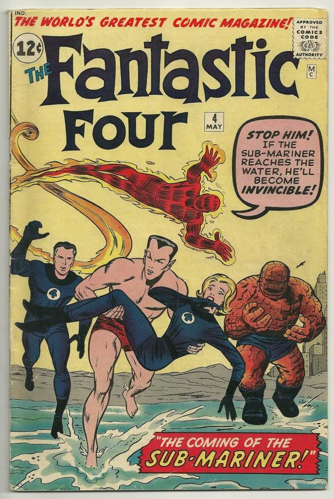
-
55th birthday of the Smurfs is in three weeks.My copy
-
Inspiring! Makes me want to go on a junk hunt for cool pieces to fix up.Found this cool looking cabinet thing with 15 long, flat drawers sitting outside an antique store with a tag on it that said "for paper collectibles?". It looked to have been a former tool/hardware chest based on some of the junk I found in it, and was in rather rough shape. Here's initial state:
Here's the repurposed finished product...a new paint job and added drawer handles on each drawer with sliders underneath. Lined the drawers with black felt, and filled them with some paper collectibles!

That's very cool.
-
That looks nicer than the second Marvel Tales reprint (issue 209), which has a different cover by Mike Zeck. I'm partial to the Gil Kane cover.Got these today as early 40th birthday presents.
I never realized I can afford the story by buying the Marvel Tales reprint (which has also a cool red cover, better than the yellow one, IMO)…

-
I'm loving the Dr. Doom cover cameo.


Copper Age on the forum
in Copper Age Comic Books
Posted