-
When you click on links to various merchants on this site and make a purchase, this can result in this site earning a commission. Affiliate programs and affiliations include, but are not limited to, the eBay Partner Network.


fidei
-
Posts
16 -
Joined
-
Last visited
Content Type
Forums
CGC Journals
Gallery
Events
Store
Posts posted by fidei
-
-
BarnGirl.Creations
I sent you a message. Thanks!
-
RCGoldenage,
Yes, Thats the sort of thing I am looking for.
Sent you a message.
-
2 hours ago, Lazyboy said:
Go look at some 9.8s with fugly diagonal miswraps and come back and tell us the answer. You can find lots here.
Oh yes, I've seen that... So I must be in the crazy old guy who is too picky club!
I have seen many times here, "buy the book, not the grade". No more fuzzy photo buys for me while expecting the CGC grade to fit within my reading of the grade.
-
Thank you all so far for your comments.
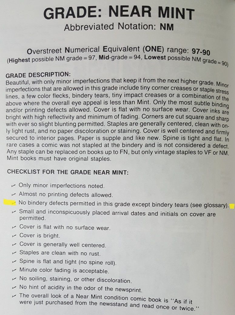
Enclosing details from the '92 grading guide I use. (I know I should update...)
The numbering system has changed, yet CGC is still using the same basic guidelines for each grade don't they? Meaning no obvious bindery defects in NM, even NM-?
As I try to gauge my own process, a 4 mil difference from top to bottom of book strikes me as an obvious bindery defect.
Any opinions are appreciated.


-
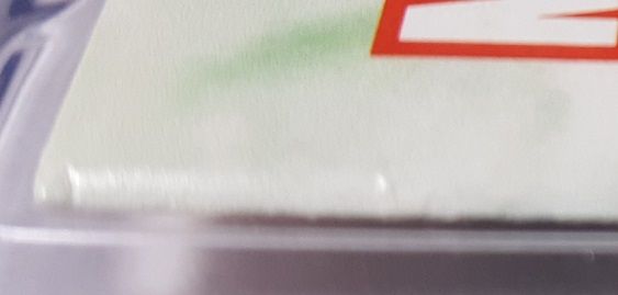
I have just started buying a few comics again after about a 10 year break. Had not bought any CGC graded books until about 3 months ago.
Bought an NYX 3 on line graded at 9.2. When the book arrived you could easily see that the book is not cut square. I did not notice the issue in the JPG's and it was not discussed in the listing.
Across the top the book measures a little over 169 mm, while across the bottom it measures a little under 165 mm.
How square the cover is should be factored into the grade?
4 mils seems like a lot.
There is some spin stress that is noticeable and an impression on the cover near the Mature readers label and the UPC code. Most of it I could not get a good photo of and not so troubling to me. The staples are not centered either.
On the back there is more spine stress than on the front, but an obvious ding that rolled the paper up on the corner.
My collecting goes back to the very early 80's and I still catalogue my books using the old 1992 grading guide, so maybe my expectations are off. But normally I lean to wanting a book that's centered and squared. Should I over look the 4 mil difference in this grade?


-
Still searching for Ethel Hays pen and ink Artwork.
Also art by:
Nell Brinkley
Lily Renee
Jill Elgin
Anne Sefon Fish
Helen Stratton
Dorothy Flack
Virginia Sterrett
-
Thanks for posting. I have never seen that one. PM sent.
and a reminder to anyone looking, PM me with Hays art and let me pay too much for it!
thanks
-
Bump...
Still in search of Ethel Hays and Nell Brinkley art.
PM me if you know where to unearth some!
thank you
-
Still searching for Ethel Hays art.
Also looking to buy Nell Brinkley art.
Please PM me with any clues!
Thanks
-
GabrielV, if you are out there, I sent you a PM.
Also, for anyone else reading this: I am still kicking myself for not continuing to bid up Nell Brinkley that was on Heritage in December. Anyone know anyone who has a nice Brinkley they might part with, let me know. I will make a very strong offer on the right piece. (i know about the ones at ebay).
-
Still in search of Ethel Hays pen and ink original art from the 20's into the 1940's.
Willing and able to pay well over market value for a nice example of her work.
Someone has to have some or know of someone who has a piece or 2. Even if you have not considered selling, I am a motivated buyer who will make a strong offer on the right art. (and yes, i know there is a head sketch at ebay, my search is for a more significant work. and yes, I've written every dealer i could find).
Also looking for printed copies of her sundays, strips, etc. Even if they are pasted into scrapbooks.
Thanks in advance for any leads!
-
Along with Ethel Hays, I'm in the market for Nell Brinkley published pen and ink work.
-
Looking for Ethel Hays pen and ink art. Specifically interested in he 1920's to 1930's newspaper illustrations and strip art. Focusing on spot illustrations from the Cleveland Press, Strips like "Vic and Ethel", "Ethel", on through to her work for NEA with the "Flapper Fanny Says" single illustration strip.
also interested in tear sheets-clippings of the same work.
If you own any, or know anyone who does, even if it is not for sale, let me know...
top dollar paid for the right stuff!


$ WTB Ethel Hays line art from the 1920's-1930's
in Original Comic Art Marketplace
Posted
Thank you, Richard, for finding me and selling me this excellent original art. I appreciate you being so easy to work with.
And to anyone interested he has some other nice art/illustrations available.
Also, anyone with Ethel Hays, Nell Brinkley, Virginia Huget, Dorothy Flack, and more, I buy that art!