-
When you click on links to various merchants on this site and make a purchase, this can result in this site earning a commission. Affiliate programs and affiliations include, but are not limited to, the eBay Partner Network.


Juswuh
-
Posts
396 -
Joined
-
Last visited
Content Type
Forums
CGC Journals
Gallery
Events
Store
Posts posted by Juswuh
-
-
On 9/30/2018 at 2:46 AM, kav said:
I would not have been mesmerized by this whatsoever. I would have said dad can we leave now?

And if you thought the cover was bad, wait till you saw the insides.
-
9 hours ago, RockMyAmadeus said:
It does! That has a nice classic look to it!
Probably because it's a swipe from Kirby. See the splash page to FF #83.
-
On 17/03/2018 at 10:17 AM, Get Marwood & I said:

That art looks very much like Steve Ditko??
-
So what if he did?
-
Ditko inked by anyone else isn't Ditko, to me anyway. He does so little art in the pencilling that either it comes out in the inker's style, or else the inker has to make an effort to finish it as fake-Ditko. (Better the first, I think. The second is totally pointless. When he gave up inking his own work-for-hire art he might as well have publicly announced that all that stuff was hack work.)
-
To be fair, it's not hard to find another copy of that book - is it? Doing that to a rare high grade book would be justification for manslaughter.
-
3 hours ago, ComicConnoisseur said:
One thing with Ramos. He was a good Impulse artist. He should have stayed with Impulse because his art didn't suite Spider-Man.
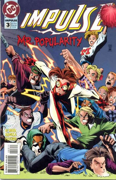
I think what Marvel was trying to do was make Spider-Man more youthful with Ramos,but of course history tells us it backfired.

That cover's certainly better (earlier?) than what I've seen from Ramos before. Somewhere along the line he seems to have turned up the distortion into wilful, pointless ugliness.
-
Ditko. Everything that makes Spider-Man what he is was laid down in those stories.
Ramos should not be in any poll that doesn't include the words "worst" or "ugliest".
-
-
On 01/03/2017 at 4:05 AM, Loukayza said:
Almost annoying as the people that quickly send you a message after ignoring your couple of thousand positive feedback and happy customers to quickly say "please package my items safely"....
I got that once for an auction of two large heavy hardcovers and felt I'd like to swipe the guy over the head with them.
-
On 19/07/2017 at 8:18 PM, Marwood & I said:
It's no good Ken, I can't beat it.
But all these covers smell.
Boring....

Spidey Battles! - while the chorus line looks on!!!
- lizards2 and Get Marwood & I
-
 2
2
-
On 11/07/2017 at 7:01 PM, Ken Aldred said:
Hard to believe it was drawn by BWS.
Barry Smith's early stuff was a bit... uhh. He drew people as if their skulls were shaped like light bulbs.
Going on topic: for sheer ugliness, nothing comes close to the Ramos covers. His art isn't just bad, it's physically disgusting.
-
For signing, I'd suggest Shield 4 or Strange Tales 167, both have got good bits of white space.
-
On 04/06/2017 at 11:53 PM, Jaydogrules said:
Why has AF (continued) to explode in value?
Quite simply, this:
http://screenrant.com/spider-man-kevin-feige-greatest-superhero/
In the immortal words of Mandy Rice-Davies, "Well he would say that, wouldn't he?"
-
I think a lot of "silent" comics feel ponderous, and pretentious. There's also an irony in certain books having their writers billed bigger than the artist and containing page after page with not a single word.
-
2 hours ago, Hamlet said:
Citing low print runs as the death of comics is like citing CD sales as the death of music. Music isn't going away, it just gets sold on iTunes these days instead of on a plastic disk.Musicians from more than one long-established band have said it isn't worth their time/money to put out a new album these days...
-
Hands down the worst. So ugly I can't even bear to own it.

Lame villain, squiggle lines all over it like a kid with an ink pen, 2/3rd of the team down, ugly drab colors, no Titans logo.
Just pure mess.
Not to mention the hacked-off expression on Robin's face - like, "Why am I working with these losers?"
-
Planet Of The Apes won the 1968 Oscar for best make-up. Arthur C. Clarke said he wondered if the judges thought 2001 used real apes.
-
The FF #66-67 story is not simply an "origin": is one of the most accomplished Lee/Kirby stories, and in my opinion one of the best Fantastic Four stories ever, and it is entirely centered around Warlock and his "fathers", with Alicia playing one of the most important roles ever. The climax is built up all along the two issues, and the story is also a poignant reflection on the theme of scientific research and man’s thirst for knowledge and power, that in my opinion it can be considered, a lot more than other similar cases, a single story.
Actually Kirby's original idea for the story was drastically altered by Stan Lee. Kirby intended the scientists of the "Beehive" to be good guys!
-
Got to own up I don't possess any OA myself! But it's a fascinating subject.
-
Don't suppose you know Pete Higham?
Afraid not.
Several of the stamp images seem to me to be obviously copied from books published/dated 1965 - Marvel Girl, Loki with winged headband, Stan with hat, Shazana. And why do a stamp for a one-off Dr Strange villain and not Baron Mordo, who was by far his most-featured bad guy of the time? It suggests someone picking characters without really knowing anything about them, perhaps not even their names since several stamps are unlettered.
-
When there's a goal at Anfield you can hear it from here.
-
To me it looks as if someone in 1965 was given a handful of that month's Marvel comics and told to copy the faces - quite possibly someone who'd never seen any of the characters before. (Yeah, there was some crude artwork in early Marvel stories, but did anything as bad as that Dr Doom ever get into an actual book?)
They also remind me of the ads for a Marvel board game which appeared in the comics a while later (early 1967?) which showed extremely amateurish pics of Giant-Man and the Wasp, among others.
-
For $2,000 I bet you could get Ditko to draw you a new original!
Plenty of other artists, but not Ditko - he has actually turned down commissions, saying that he's only interested in producing work for publication.


Most ridiculous comic panels of all time?
in Comics General
Posted
"Wank!" does actually sound like the noise a large metal disc would make when it hit something.