-
When you click on links to various merchants on this site and make a purchase, this can result in this site earning a commission. Affiliate programs and affiliations include, but are not limited to, the eBay Partner Network.


AndyFish
-
Posts
1,908 -
Joined
Content Type
Forums
CGC Journals
Gallery
Events
Store
Posts posted by AndyFish
-
-
New England in Cambridge is on the smaller side- but they have a decent stock and its only around the corner from the Picnic.
Million Year Picnic USED to be the entire basement floor of the building, and they had golden age comics displayed for sale on the roof beams. I bought a Batman #6 there as a teen after riding my bike the 40 miles to get there, rode it all the way back home only to find out the centerfold was missing! But they were good about it the next time I was in.Today it's a tiny shop but its crammed with stuff-- mostly modern and collected editions but the selection is great.
There's also Comicopia over near Fenway Park which is also a more modern store. If you're looking for back issues one of the New England Comics stores has a Golden Age room-- it's NOT Cambridge or Brookline because I've been to both of those often.
If you're going to be renting a car-- drive 45 minutes west and you can hit up THAT'S ENTERTAINMENT which is a 10,000 square foot comic shop in Worcester, they have a ton of bronze and copper in hundreds of bins, and a smaller selection of silver and gold in a display case in front, and if you're bothering to make they trip to Worcester, Holden is only 10 mins north of it and you can set up an appointment at SuperworldComics and see what Ted Van Liew has-- but he is appointment only and they do Detroit 5/19-5/21 so expect them to be gone a few days before and a few days after that. Ted has an amazing selection and is one of the nicest guys in the biz. The good looking young guy who works for him is my number two son Joe.
-
One of the benefits the artists have is we don't pay for our tables (well, the folks in Artist Alley do) or travel and hotel so in that regard we have it over the dealers. The downside is you're drawing almost the entire time you're there, and that includes off times-- because you either have commissions due or you're participating in the drink and draw charity events, and even though if we stayed home and worked in our studios we'd be drawing all that time as well, it's much harder on the road because the conditions are not ideal. You always forget a supply, the lighting is sometimes bad and you're sitting in a crummy folding chair.
-
Great thread-- I'm really digging it.
I'm not going to hijack it, so I'll keep this short; I've done shows as an invited artist, last year I did close to twenty five shows from East to West Coast. All of these were big shows-- Heroes, Wizard, Rose, Emerald, etc. and once a year I help out a friend by driving his collection halfway across the country to Chicago and I spend the weekend working his booth-- so I get to see it from two perspectives.
It's quite a world "behind the scenes"-- the biggest take I got from being a comic dealer is that if (at least at the big shows) you are a collector the thing to do is to somehow get in to help your dealer friends set up because THAT is the day that all the wheeling dealing is done. Dealers run around buying from each other, and sometimes at crazy prices-- and then sell those very books at their own booths at the very same show. There are lot of big collectors who are not dealers going around too.
Set up at the big shows is crazy when you compare setting up as an artist. For dealers there is a load in time usually a dock area or they drive their trucks and vans right onto the show floor, it's pandemonium trying to get pallets of stuff through the aisles and you are very likely blocked in while you unload. Then there is a mad scramble to get the vehicles off the floor. Break down is almost the same but most of the trucks and vans are off the floor this time, and instead you have dealers dragging pallets to the loading zone area at a race to see who can get out first.
Contrast with setting up as an artist-- you don't arrive a day (or two!) early, you arrive about an hour before the show opens, you check in, they give you your meal passes, invitations to events, a heads up as to where the free food and refreshments will be set up off the show floor and most of the time an escort to your table and even an assigned staff member who will be your gopher for the weekend. At various times promoters will come over to make sure you're doing well, and you're asked to donate art to the event auctions or charity projects.
Biggest thing for artists vs dealers-- an artist has a great weekend if he does $4-$8k a dealer five to ten times that.
-
Wow seems like another CGC stumble here.
-
-
Comics don't have the entertainment value associated with their price point. Even at the cheapest point, DC's $2.99 how long does it take to read a story? Ten minutes? If I'm a kid with an allowance and I like to read I can buy a "real book" for $6 in the paperback section or a Kindle Copy for 99c and have something that takes me at the very least a few days to read.
We're moving closer and closer to Trade Paperbacks being the norm and pamphlets going away. Diamond wants it that way. Any really GOOD comic shop understands the shelf life of a TPB is infinite while a monthly has about 3 months before it's in the back issue bin. But then Marvel does things like have $35 trade paperbacks? Insane. The $100 Omnibus books? Is ANYONE paying full retail for those? I have a huge collection of them, but I think the most I've ever paid for one was $40.
Digital is also a huge solution but you're never going to see it eclipse print when a digital copy is the same price as the print edition. Where is the logic in that? No printing expense involved and the price remains the same? Why? Because the publishers know if they did all digital at 50c or a dollar they'd end print completely. But the bottom line would be higher overall sales. Like it or not, and I know a lot of people on here don't-- digital is growing and THAT is how most of the new generation will read. When I was in Japan last year EVERYONE was reading on their phones and tablets, and a lot of what they were reading was Manga.
But imagine if you took the endless archives of back issues Marvel and DC has and offered the digital versions of individual issues for 50c or two for a dollar. They would ignite sales of books that they've long since made money on because they are out of print and they'd hook a new generation of kids on the good stuff.
When I was doing a comic art class for middle school kids a few years ago I brought in stacks of books for them to have and to read. The first batch I brought in was Jim Lee style work--- thinking the kids would like the new stuff. To a kid, they found it hard to understand what was happening. The storytelling was confusing. Then I brought in a bunch of Marvel Tales featuring Ditko Spider-Man and they ate it up. Wanted more even.
That showed me first hand that we feed the cult with ridiculous layouts and pinups every other page, but we lose people who haven't been reading comics for years.
We need more people like Jim Shooter back in the leadership of these companies-- he understood that every comic book was someone's first.
-
Chapter 14

-
Proportions are way off-- but so too were some of the drawings he did in his remarqued autobiography. I'm not saying it's Kane, and I'm definitely not saying I'd pay anything CLOSE to $10K for it but it has some trappings that indicate it's by the same person who did some of the other pieces shown here.
-
12 minutes ago, Captain Canuck said:
They are selling a similar Kane drawing on their website that is very suspect.
http://www.allanimation.com/jocapebaro.html

And it could be yours for only $10K!
-
It's funny, I first came into this thread and thought "ugh, all fakes". Then looking closer and closer at them you see the pattern, and Kane was all about pattern. Drawing the same things over and over and over again until he could almost do it without someone's help. Kane was also an opportunist who wasn't against churning these things out when the first few movies made him popular again and before people were really talking about what happened to Bill Finger.
But how many could he seriously do? He was an old man by this time, and this piece here is clearly a marker piece and it would be at least 20 years old since Kane died in 1998.
In this case Penguin and Catwoman look way off, but the feathering is in Kane's style, so are the buildings, and Robin's head matches one in another piece that looks like Kane could have done it.
Here's my thought-- either these are Kane pieces and he just did a whole pile of them basically doing the same elements over and over again, or they have someone who is churning these things out, but most of them look like they were done by the same hand.
-
Hey Martin
OK, so I've got some expertise to throw in here, being a lifelong Batman fan, someone who spent a great deal of time with Jerry Robinson, a bit less with Shelly Moldoff but enough that I learned some of the techniques they used, as an art collector, an artist myself and someone who has worked for 15 years in the comics industry as a ghost myself-- I know a thing or two about aping styles.
I agree on not giving the signature much weight, THAT is the part an amateur spends the most time and effort on. Instead, try to look at the confidence of line, little details like the feathering of the inks, how hands and feet are done, most artists have a sort of "go to" for hands and feet and Kane and his ghosts were no exception.
Here are my thoughts on these;
Number 1 is completely fake and poorly executed. The bodies are way too long and this is based on a published image that was done in the early to mid sixties with a hint of one done by Curt Swan a bit earlier. This is not professional level by any means. There is no variation in line weights and the hands are atrocious. Ironically the one thing Kane did well was draw hands, and by well I mean in the Kane world-- he would often put a hand on a characters chin while they were talking. But there is a famous story about an editor asking him several times to draw a hand in the DC offices on a page he was bringing in, he kept stepping out of the editors office to do it and each time he came back in it was worse than when he'd left. After several attempts he comes back in and the hand is perfect. The editor thanks him and Kane leaves. When the editor walks out into the bullpen he finds an artist sitting there who says Kane just paid him $50 to draw a hand. So who knows if he was really even drawing those hands on chins in the first place.
Getting back to #1-- the Batmobile tires are completely out of perspective, this was done by someone with very little art training, and done poorly.
Number 2 is the most likely "real" Kane-- that's actually a pretty famous sketch he did and he did it in 1973. There were prints made of it at the time and those were circulated pretty widely for many years. I've seen more than one dealer at the big shows have this "original" though. Kane was doing public appearance drawings in marker at this time. He would bring a pad that had Batman loosely drawn already on it, and then he would finish it with his marker.
Here's an example of a real Kane Batman drawing;
 This was mailed to a pair of fans who had written to Kane, I knew one of the family members.
Kane re-used this pose again and again
Notice too that this marker has faded, while yours looks as fresh as the day it was drawn. Marker fades with age and yours looks like marker when you look closely at the darker areas of the masks.
#3 has some of the trappings Kane used in these drawings, the weird shading at the tops of Batman's ears, the way he drew mouths, but the thin line and the bad feathering also denotes an artist with little training.
But this one could be legit too, because Kane had little training.

Here's Kane's JOKER-- we know this because that's KANE Drawing him. While this one is a little more pronounced in the cheek and has the sleep eyes and yours has lazy eyes it's still got that strange cheek line that hits the curl of the mouth-- that was unique to Kane. So this one, despite being crude, could be legit.
#4 which in my opinion is the best one of the lot is not legit. The hands are wrong, the bodies are too long, the faces are not the faces Kane and his boyz practiced so much. This one is a take on the cover of Batman 3 which was done as a high end litho graph by (I think) circle press in the early to mid 80s.
#5 is so bad it could be Kane too. Look at the Joker cheek-- this looks like the same hand that did #3. Speaking of hands, Batman's open hand looks like a Kane hand to me. Robin and Catwoman's face are so off they throw the piece, but there is some evidence this could be real. That building corner was a Kane go to, but he usually only did one side in black and drew bricks on the other, he could have made a mistake and covered it with black but who knows.
#6 hands, feet, face and body all look like Kane to me. He had that strange way of feathering inside the legs to indicate muscle and that arm is spot on-- this one could be good.
#7 doesn't look right, but it's got the building corner, the style of the feet match #6, Robin's face matches #5 which leads me to think that one might be right too.
#8 has the most Kane like hands in the group, ditto the corner building, the feet, the feathering on the legs. It's the torso and the face that throw this one for me, but Kane might have been experimenting, or someone might have stopped by and he said "hey draw me a torso!" This one looks like it's done in India ink which doesn't fade.
So overall, after looking closely at these, and more closely after going through, I think you've got a pretty good chance that a few of these were actually done by Kane at a later stage in his "career"-- I'm guessing most of these from around 1989.
Please keep in mind my referring to Kane's work as bad is subjective, I'm talking as an art professor would judge a student in class. I like some of Kane's crudeness.
-
Well that's good to know.
-
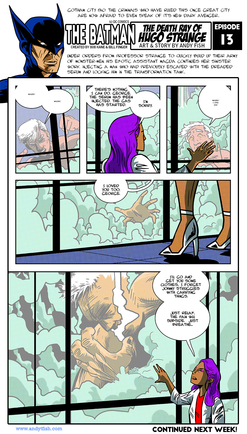
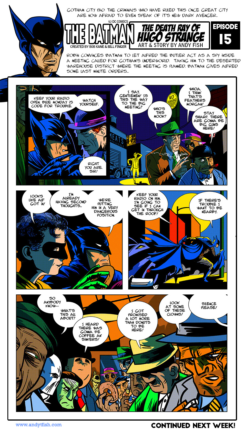
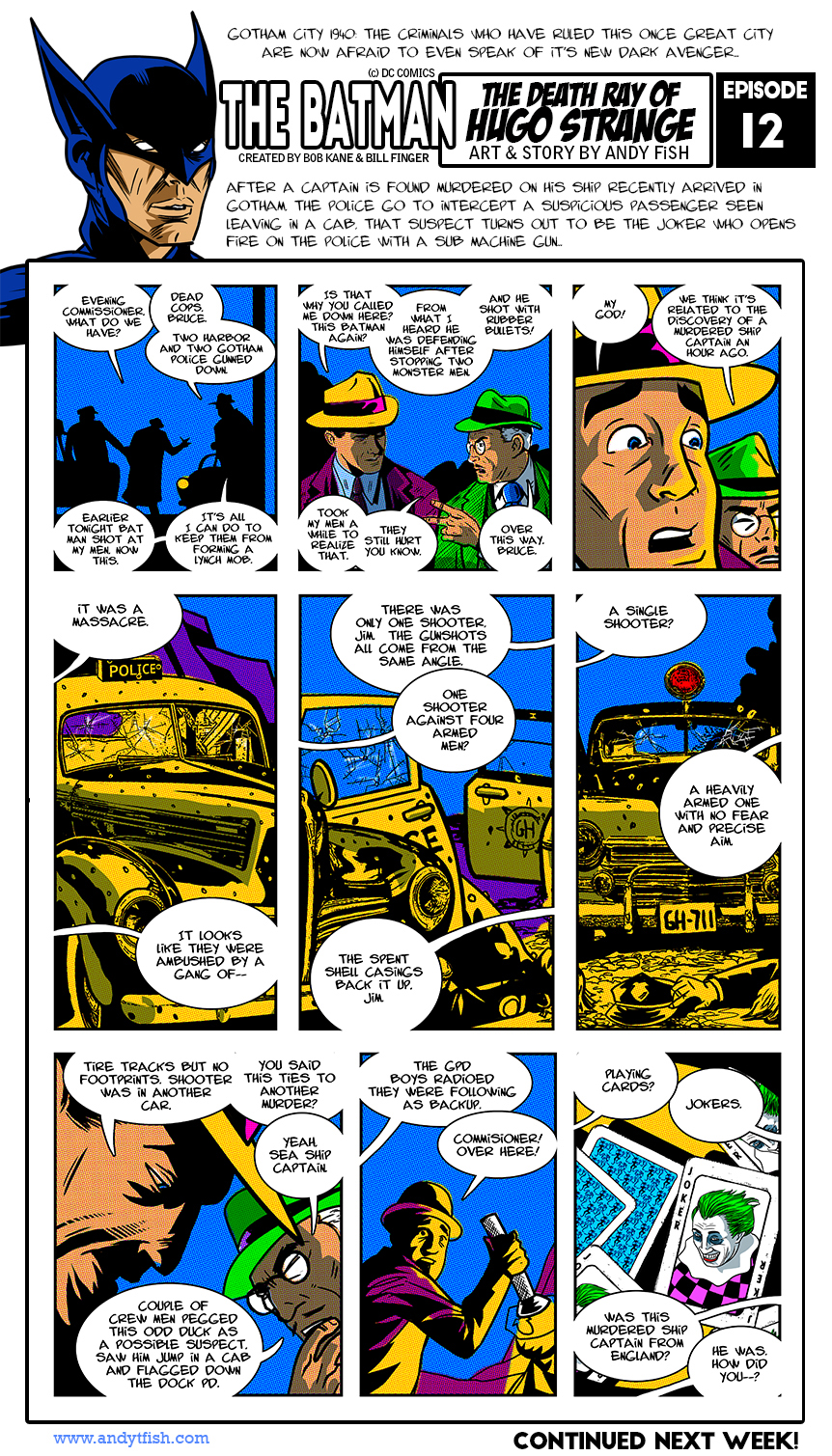
This week's episode
-
Sorry double post.
-
Hopefully he doesn't come out of this owing more than he does now, because all of this money is taxable as well. I don't wish this situation on anyone, but to think the IRS has "forgotten" your debt is ridiculous.
-
I love it! It's a real Ditko only it's actually Kirby! This guy must have a museum he's closing out judging by the other pieces he has. It's a shame someone is going to pay $300+ for a tracing.
-
-
-
Yup. It's a shame. They should require new editors to read the Masterworks as a precursor, then have them build on characters from there.
-
The comparison, I think in this very thread, to the 70s drug issues is spot on. Speedy gets addicted, drugs are bad, we got it, DC didn't spend two years beating us over the head with it. Comics should be escapist fun. When you shoe-horn politics into it and social justice you turn off 50% of your readers either way.
-
I'm afraid you might be right.
-
Great point-- as a kid I used to love Black Panther-- it didn't matter to me that he was black and I wasn't-- I liked the character Kirby was doing. I didn't need to read only white characters to feel like I could connect to it. Idiotic. I also loved the reprints of Golden Age Batman but I didn't gravitate towards it because Robin was a white kid my age-- in fact because of the TV show re-runs I didn't like Robin at all. Are kids today so mind numb that unless a comic book character is exactly like them they can't see past it? And by kids I mean READERS of all ages.
-
The biggest thing I saw was that they started pandering to their social media fanbase, not realizing that this same base "reads" their comics via free websites or just looks at pages posted by artists and then pontificate on characters they know very little about. When they started to follow what these folks were calling for they discovered they don't actually buy anything, and those of you who have been sticking around for years through storylines up and down decided to jump ship.
Politics should not enter into entertainment and neither should preaching agenda's of either the right or the left. Just make good damn comics and keep them on a regular schedule. Deliver what you promise and avoid gimmicks like variant covers and reboots.
-


 Kane had pretty much practiced how to draw these two head shots over and over-- and you can see these are done with marker.


My Latest Project: The Bat Man
in Comics General
Posted