-
When you click on links to various merchants on this site and make a purchase, this can result in this site earning a commission. Affiliate programs and affiliations include, but are not limited to, the eBay Partner Network.


glendgold
-
Posts
1,332 -
Joined
-
Last visited
Content Type
Forums
CGC Journals
Gallery
Events
Store
Posts posted by glendgold
-
-
I can't page all the way through that film/tv thread, but I'm going to assume it mentions how the entire plot of The Ice Storm hinges on the lead's interpretation of FF 141.

-
And Robert Sean Leonard tries to seduce Chloe Sevigny by showing off his Carl Barks original art in The Last Days of Disco, which someone seems to have screenshot: http://perusingcomics.blogspot.com/2014/09/67-last-days-of-disco-1998.html
If she was unimpressed it might be because they seem to be color guides.

- delekkerste and grapeape
-
 1
1
-
 1
1
-
I wish I had seen this with my own eyes, but back when grafitti on subway cars was a competitive sport (think 1976), famously someone had tagged an entire car with "GET DOWN AMERICA" and the huge Bernie Wrightson portrait of Howard the Duck.
Couldn't find it in google images, but here's a consolation prize - taken from the cover of HTD 20, I think?

- BuraddoRun and grapeape
-
2
-
8 minutes ago, stinkininkin said:
I had no idea Adams light-boxes his commissioned head sketches! That's fascinating. Collectors are cool with this (because it keeps up availability and prices reasonable)? Are there other artists who do this?
I don't know about modern artists but Segar used a stencil with Popeye when answering fan requests. The stencil came up for auction a few years ago - one of our fellow collectors bought it.
-
-
A friend of mine involved with this project sent me their website. It's got some very cool images, and maybe just maybe someone here knows where some of the lost artwork is. Check it out: https://www.lostartofoz.com/
G
-
-
17 minutes ago, aokartman said:
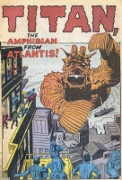
As published, it seems the train was removed, or was added onto the original art after publication?
From the Jeff Gorrell CAF page.... "I've added a color image of the splash page that was actually published. It's not the same as the original art. The best I can figure is that Kirby needed to simplify the splash page; he redrew the section with all of the building damage so that Titan's arm is menacing but not hitting the buildings. The redrawn area would have been removed once the page was printer ready, leaving the original damaged buildings in the final version of the art. Apparently, someone tried to remove the white out or the overlay for those buildings. The result is fairly amateurish with some less-than-smooth inking in that area."
David
Ah...right. This is ringing some bells. Someone theorized that the Code didn't like the train smashing -- too scary. Thanks for the info.
-
My brain is a sieve. Does anyone else remember this splash coming up in an auction within the last, I dunno, 5 years, with some kind of whiteout or corrections involving the train in Titan's...paws? Are those paws? Fins? Anyway, the train looks odd to my eye and I feel like this was discussed before. https://comics.ha.com/itm/original-comic-art/splash-pages/jack-kirby-and-russ-heath-tales-of-suspense-28-splash-page-1-original-art-marvel-1962-/a/7236-94083.s?ic2=mytracked-lotspage-lotlinks-12202013&tab=MyTrackedLots-101116
-
- Popular Post
- Popular Post
1 hour ago, BuraddoRun said:Why do people bid on this stuff? I mean the really terrible ones, just...why!? They are so obviously fake and look horrendous. I truly don't understand...
You say "obviously fake," but to some people they truly aren't obvious. That's one reason I keep linking to auctions, even when I think "no, there's no way anyone could think this was real." Because everyone's eye is different...
-
If only this was a wristwatch: https://www.ebay.com/itm/373282622540
-
53 minutes ago, comix4fun said:
The closest I ever got was watching Russ Cochran bidding on animation art on behalf of clients....and just wouldn't lower his bidding paddle.
Last big HA event, I opened my browser, left the room to get my coffee, and came back to see my cat walking back and forth across the keyboard. I was afraid he'd pulled a Russ.
-
On 10/14/2020 at 11:49 AM, NamesJay said:
Whoever comes close to guessing final bid will win a prize!
Okay, I think we all need to know more about this prize at this point.
-
1 hour ago, jjonahjameson11 said:
As a Spidey guy who likes Romita art, I should be all over this, but I’m finding it difficult to feel excited about this cover, because:
1. Um, it’s the Kangaroo. Ohhhh, ahhhh, lame-o.
2. Spidey’s back is facing the reader, a deterrent for me.
3. It’s just a normal looking guy wanting to jump on (over?) Spidey. No super villain costume, no death-ray or otherwise perilous contraptions to add to the frenzy and danger of the moment. Just...YAWN 😴
But...but...he's wearing a vest.
-
I can't put my finger on it, but this thread reminds me of the scene in Logan's Run where everyone in the stadium is chanting "Renew! Renew!" and taking bets on who will be renewed, somehow never taking in that every contestant dies anyway.
Mebbe ya had to be there...
-
-
22 minutes ago, miraclemet said:
2M is hyperbole. GLL/GA 76, another iconic cover of the era sold for what $400k? ASM100 sold for $400k two years ago? The market has gone up, but not that much for the iconic grail pieces.
The only stuff breaking the $1m mark is painted covers that have crossover appeal to the fantasy markets (that have far deeper pockets). Frazetta has topped $1m, but no one else.
But you forget...what if there are...
SpoilerSHENANNIGANS
-
I have no opinion on the value until we hear a good condition report and get better scans.
Also I am skeptical that this will appeal outside of our community. This isn't an X-Men or Avengers level of character. The Punisher logo is known out there, but not so much the character. And, uh, I think guys who like the logo have already spent most of their disposable income this year on ammo.
-
-
1 hour ago, batman_fan said:
That book is highly coveted. I thought there was someone trying to put the entire issue together a while back but could be wrong.
The page that went for 155K was a half-splash with the Surfer. And a collector was putting together another Surfer book but not this one.
-
2 hours ago, Lee B. said:
And here's a few more covers offered in December 1992 from other sellers (mostly Ike Wilson):
http://www.comicartads.com/content/captain-america-108-cover
I think that cover didn't sell then, as it ended up in the summer 1993 Sotheby's auction. I want to say it went for $1800 there, but I don't have my catalogue in front of me.
-
28 minutes ago, BuraddoRun said:
I thought Shatterstar was cool when I was younger. C'mon, he's got a double-bladed sword! That's XXtreme!!!
Also, feet!

Wait, so Shatterstar above has feet...and very few pouches.
The Shatterstar in the original artwork for auction has no feet...and yet...many pouches. >shudder< WHAT'S IN ALL THOSE POUCHES?
-
On 10/1/2020 at 6:15 PM, TeddieMercede said:
This one you've been waiting for.

I have never seen this piece of art before, I don't know who the character is, I don't know what book it's from, but it's Liefeld, right? I could tell because + pouches and - feet.
-
This is a masterpiece, only not in the way the artist intended.
https://www.ebay.com/itm/124355697122
Every escalating detail in the description makes it almost glorious in its struggle to be even remotely related in any way to Jack Kirby. Chapeau bas, dude. I'm particularly fond of his use of the words "re-envisioned," "embellished," and "completed." Although his covering all bases by ALSO coming out with a litho of this piece is a kind of genius. Especially given that there's debate about whether Jack even drew the piece that he traced.


Comic Art in the strangest places
in Original Comic Art
Posted
Ah! This reminds me! The McDonalds in Nipomo, California had *many* Image covers on the wall in the late '90s/early 2000s. The guy who owned the franchise was a collector.