-
When you click on links to various merchants on this site and make a purchase, this can result in this site earning a commission. Affiliate programs and affiliations include, but are not limited to, the eBay Partner Network.


Carlo M
-
Posts
436 -
Joined
-
Last visited
Content Type
Forums
CGC Journals
Gallery
Events
Store
Everything posted by Carlo M
-
At the end of the day, I figured it is better to share. BTW, as to the inker on this piece, Heritage says "The inker is unknown, but both Dan Adkins and John Verpoorten have been suggested". Any idea anybody?
-
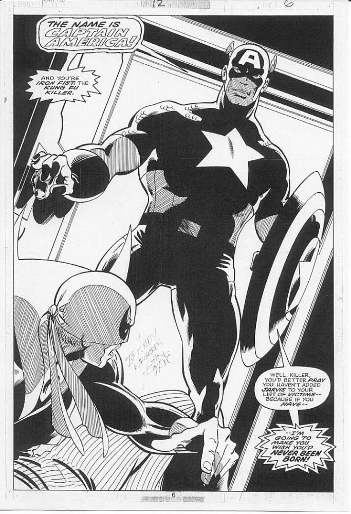
To post or not to post. That is the question. I decided to post my big win.... https://www.comicartfans.com/gallerypiece.asp?piece=1598886 Happy 2020 to everybody!
-
I agree with you! I threw away the first one I got and then I regretted it because I feed somehow my copy is not complete any longer. I simply keep my AE books piled up in their boxes.
-
The Official 2020 OA Collecting Goals Thread
Carlo M replied to delekkerste's topic in Original Comic Art
After a big buying spree in 2019, I am down to just a few "must haves" to fill holes in my collection: - Vintage Perez Avengers (ideally with Marcos or Grainger) - Vintage cosmic Starlin interior - GoTG by Milgrom (from the classic run in Marvel Presents) - Possibly (only if the right page comes along) '70s Buckler / Pollard / Perez FF, Brunner Dr Strange, Art Adams X-Men related Does not need all to come in 2020! Other than that, I will treat myself here and there if anything catches my fancy, either vintage or contemporary. I am afraid I will always be tempted by vintage X-Men (all the usual suspects) and Defenders (Buscema and Giffen) -
Interesting that people mention the nuisance of getting offers as a third reason for not posting (in addition to security and resale value). I am not bothered at all when I get an inquiry emails. It only takes about 10 seconds to respond and people do get it if an item is not for sale. In fairness, on a few occasions I decided to sell at very attractive prices. And I have myself made offers that were accepted through CAF, even though I do it less and less frequently these days. I totally second that it would be much better if there were fewer soft porn submissions, but freedom of expression has to prevail, I guess. Net net I like to post. I like figuring out an intro that describes how I feel about the piece. I like receiving and posting comments and it does make me feel part of a community. And as a Europe-based collector, it was important to post my collection to have credibility in dealing with other collectors. I have also established some nice dialogues over the years and that would not have been possible without being transparent on my collection. So I will continue posting, even though on a couple of pieces the resale value argument is winning... Carlo
-
A friend of mine commented a few months ago that he could see less and less high end pieces being posted on CAF. At the beginning I shrugged it off as not proven. Then I started to pay attention, and indeed very few of the big pieces going thorugh auction are resurfacing on CAF. Now we all know that a big part of collectors do not post all of their collection on CAF, but is there a trend here? As pieces become more valuable, are people getting more nervous to show them off (either for security reasons or to protect resale value)?
-
Slightly off topic but I had to add my contribtion to the gallerry of Mooney's beautiful women (and in perfectly good taste too....just referring to another popular thread these days...)

-
Who are some newer and/or lesser-known artists that you're into?
Carlo M replied to NC101's topic in Original Comic Art
Among the newer artists I loved loved Andreade's work on Cap Marvel. Definitely different and yet classic. On lesser known artists (at least lesser known today) I continue to be a big fan of ChrisCross but he does not seem to be interested in doing regular work. -
I will go with personal taste as opposed to impact / value / broad popularity: 1. Byrne / Austin (no need to comment...perfection for that title) 2. Paul Smith (less is more) 3. Cockrum 1st run (those blacks....) 4. Silvestri / Green (the issues inked by Lehiaoa and Rubinstein were definitely not at the same level as with Green). Agreed his art on UXM was quite loose, but maybe because of this it continues to feel very fresh to me even today 5. BWS (186 and 205 are absolute pinnacles of modern comic book art, IMHO) 6. Neal Adams (would deserve top three just for the Havok costume design) 6. Jim Lee / Williams (when those issues came out ....wow did they make a big impression). BTW I really liked the issues inked by Green (248) and Rubinstein (257) too
-
How "seriously" is OA taken by the mainstream art world?
Carlo M replied to NC101's topic in Original Comic Art
That is EXACTLY what I meant! Perfect example -
How "seriously" is OA taken by the mainstream art world?
Carlo M replied to NC101's topic in Original Comic Art
The topic is well rehearsed but I still find it quite interesting, and worth updating every now and then. I am not as pessimistic about the chances that in the future there may be some recognition. Last year I had a family friend for dinner. She used to work at Christies London. I showed her my collection and she was quite interested. She was able to discern quality pieces and could "get" the content of my covers and splashes. Obviously the relevance of my Dark Phoenix interior panel page was totally lost on her. I think one interesting question to take this topic further is: which pieces are the most likely to get some interest from the fine arts folks. One would need to get away from the context, and judge a piece solely based on its intrinsic aesthetic qualitities. Ranking our own OA this way might be an interesting exercise: one may not get the same ranking as a USD value ranking, but still could yield some interesting results. I think the piece from my collection that could get the highest interest would be this one: https://www.comicartfans.com/GalleryPiece.asp?Piece=460352 Care to do the same with your collection? -
Any opinions on why Erik Larsen doesn't fetch higher prices?
Carlo M replied to NC101's topic in Original Comic Art
I like his Defenders run...granted I am a Defenders nutcase, but I thought it was different and very energetic. I have not come across the right page but sooner or later I might get one. -
No more wishes for me as this year / decade saw many may acquisitions, possibly too many! But for the next decade I need a Bronze Age Avengers Perez, possibly with Marcos inks.
-
I stand corrected! I did not check the image again and was going by memory! agreed it is a great page and it has the shield effect of cinematic fame! Take it ouf my list!
-
The most glaring results have been commented, but there were some other very strong results, in my mind: - FF 83 page USD26400. Great looking page, but no FF! This and the Amazing Adventure splash show that the Inhumans are viewed as a hot Kirby property. I wonder whether these strong result will unlock some demand for the BBolt half splash from FF 59 - Brunner Dr Strange page USD13200. I don't recall a Brunner interior page going that high. Silver Surfer and Valkyrie premium? - Byrne MTU page USD 9300. Great run, but still quite strong price for this particular page - Severin Dr Strange page USD7200. Another great looking page without the main character. In general, it looks like quality of the image is getting appreciation by collectors. On the other hand, I expected more for the McFarlane SM splash (USD36000). Impact of faded inks?
-
I think those price levels refer more to the red costume materials. Somehow the earlier issues with the Yellow costume seem to command lower slightly prices, even though they are (reportedly) Wood pencils as opposed to Powell / Wood.
-
See my eralier post, which I transcribe here: I have a bit of a vested interest, yet I found very suprising that both Sal's Cap and Kane's Thor covers ended up higher than the Avengers cover by Kirby. I wonder if this is due to i) good quality of the Buscema and Kane covers (both really good IMHO), ii) a bit of fatigue by Kirby investors after the Cap cover and the FF Annual stuff, and given the Silver Surfer pin-up coming right after (excellent piece, congratulations to the buyer?), iii) the Avengers cover not being from a peak Kirby period. I guess a combination of all the above is probably the right answer
-
I have a bit of a vested interest, yet I found very suprising that both Sal's Cap and Kane's Thor covers ended up higher than the Avengers cover by Kirby. I wonder if this is due to i) good quality of the Buscema and Kane covers (both really good IMHO), ii) a bit of fatigue by Kirby investors after the Cap cover and the FF Annual stuff, and given the Silver Surfer pin-up coming right after (excellent piece, congratulations to the buyer?), iii) the Avengers cover not being from a peak Kirby period. I guess a combination of all the above is probably the right answer.
-
Apart from a few very specific pages that carry a very strong emotional value for me (for example, Hulk 206 and 207 splashes with the Defenders by dream team Buscema Staton or Defenders 50 DPS by Giffen): - A killer Kirby (ideally Kirby Sinnott) - A strong interior by Perez from his '70s run on the Avengers (ideally Marcos inks) - An interior by Starlin from '70s Captain Marvel or Warlock - A Silvestri cover from his X-Men run from the '80s Perez Avengers is particularly difficult as his stuff from that run seems to be quite concentrated in some collections...
-
The most blatant example is the X-Men. Cockrum and Byrne pages with Wolverine or Phoenix have been 60%-100% higher than comparable pages without. And the same would apply to the runs of the,likes of Romita Jr, Smith, Silvestri and Lee. For team books, it is generally multiple characters or key characters within the team (like Cap or Iron Man for the Avengers of Hulk for the Defenders) as opposed to pages with second tier or single characters displayed on the pages. This can represent an opportunity. For example, vintage Iron Fist pages by Byrne are super high quality and are a fraction of the price of X-Men pages (not a small fraction any longer, I am afraid). But you have to compare production from the same period. Saying that Byrne Uncanny is higher than byrne WCA just because of a difference in characters makes no sense, as they come from very different eras..
-
WTB Tradd Moore Silver Surfer Black pages
Carlo M replied to Silveriderpanther's topic in Original Comic Art Marketplace
I also tried but at one minute into the sale the item I asked for was already sold. The wole thing sold out I believe in a matter o fminutes. And prices were quite full! Congratulations to Felix and Tradd for a very successful sale! And very good news for the state of our hobby! -
I am not a Wrightson expert but I am also in the camp "lots of detail does not necessarily = great art". And that applies to comic and other art equally. Having said that, this particular piece is quite spectacular, and in this case the detail provided is probably instrumental to convey and enforce the obsession of the characters and the drama of the situation. In other cases, detail is totally gratuitous and...just not for me...
-
Sal Cap at the moment ahead of Starlin Cap Marvel and Kane Thor....we'll see.... (mind you, me loves Kane and Starlin covers.....)
-
Plus one
-
To turn the argument around here are some PROS of splashes: - As interior, they can have more refined inks, with more nuances that normally are not included in covers - Some splashes that are not title splashes can actually have a larger image. To examples below. - Comparing similar relative quality (ie A cover vs A splash), splashes typically would be 1/3 the price of a cover - Almost as rare, as there are 1-2 splashes per issue CONS - Have great variance in quality - They don't have the PROS of the covers...