-
When you click on links to various merchants on this site and make a purchase, this can result in this site earning a commission. Affiliate programs and affiliations include, but are not limited to, the eBay Partner Network.


blackterror
-
Posts
202 -
Joined
-
Last visited
Content Type
Forums
CGC Journals
Gallery
Events
Store
Posts posted by blackterror
-
-
On 10/18/2023 at 12:34 PM, lou_fine said:
You left out the first Joker cover, namely this one here:


batman_fan didn't leave it out ... because it's not a Joker cover and it's way past time to get this straight.
Things that are different are not the same.
Detective Comics 62 is the FIRST JOKER COVER. Detective 40 is a MODIFIED Joker panel from Batman 1. The modification made what WAS the Joker in the Bat 1 panel appear more like Clayface on the cover of Tec 40. Things that are different are not the same!Why did DC do this? Bat 1 was going to print before Tec 40 and DC needed another Bat story to complete the book. So, they moved the Bat/Joker story that was intended for Tec 40 into the Bat 1. Then DC prepared a new story for Tec 40 featuring Clayface to replace the Bat/Joker story they moved to Bat 1.Now the Tec 40 had a Joker cover that no longer lined up with the Clayface story inside ... so rather than redraw the cover - DC CHANGED THE COVER and recolored what WAS the Joker on the cover of Tec 40 to appear like Clayface.The cover of Tec 40 WHILE SIMILAR to the Joker panel in Bat 1 is - NOT THE SAME. Things that are different are not the same.After re-coloring the cover of Tec 40 - the Joker was NO LONGER the Joker by intent or actual appearance.Detective 62 is truly the FIRST Joker cover - not Tec 40.But wait ... some Bat 11's have earlier news-stand dates than Tec 62 so maybe - just maybe - Batman 11 is the first JOKER cover Now this has been a matter of debate for some time - here's a link to an earlier thread - but even in this thread nearmint states that the cover of TEC 40 is PRACTICALLY a mirror image from the Joker story in BAT 1 - the word practically is another way of saying - THINGS THAT ARE DIFFERENT ARE NOT THE SAME. Two identical twins are NOT the same person although they may be - practically - mirror images of one another.
- Action252Kid, Point Five and ThothAmon
-
 3
3
-
On 8/25/2023 at 5:13 PM, lou_fine said:
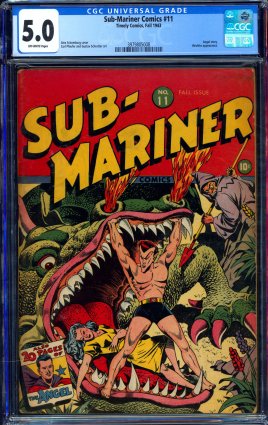
Well, well, well.................looks like they've got a near complete run of the GA Subby comics starting from the Churchill assassination #3 issue and including a couple of nice mid-grade classic cover issues:
https://www.comicconnect.com/item/1004634
https://www.comicconnect.com/item/1004636
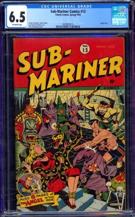
Not sure where they'll finish up at, but should be interesting to watch as Subby 11 is currently at $8,655 and Subby 13 is at a piddly $4,417 with none of that 15% BP nuisance to add on top for either of these two books.


Lou - I love these books too. Personally, I prefer the 13 over the 11 and to my surprise the price stayed low - but the 11 took off. I realize many prefer the Dragon on 11 - but that 13 wow - Schomburg at his best going wild - and to me it's the best cover in the run! I also love the covers on 5 and 6. I think the Subby 5 in this auction was baragain priced considering it is the second highest graded copy.
-
On 6/8/2023 at 10:28 PM, jimbo_7071 said:
The Okajima Catman #21 sold for $5,300.
The 3.0 Seven Seas #4 went for $7,501.
Thanks Jimbo

-
Does anyone know what price the Seven Seas 4 finished at?
I was thinking thinking $7000 was low as gocollect suggests a FMV around $12 thousand?
Also does anyone know the hammer price on the Okajima Copy of Catman 21?
-
-
Anymore wall photos? I believe Gator had a Detective 69 and 71 on his wall - does anybody know what grade they were?
-
On 4/30/2023 at 10:42 AM, Scrooge said:
Here the Title is again incorporated in the Wanted poster cover design -

Clearly - integrating the title and cover art - is not common. I thank everyone for sharing. All of these examples are great! Scrooge - I really like your Jesse James example. The title is not just part of the cover art, but it is truly essential to it. I never noticed this book before. Suh-weet!
-
https://www.facebook.com/excitingcomics1/photos/a.1558223771089769/2464766097102194/
Superman! He's not a Sissy or a Cream Puff! This wonderful cover from 1944 is so creative and under appreciated.
I love how the title is essential to the cover art as it ties into the Circus High Striker.
If the title were removed the cover art would actually be incomplete.
Can you think of another comic that combines the cover title with the cover art?

-
D84 - Thanks for sharing your Tec 62 - the first Joker cover
 Here's a commentary on that...
https://www.facebook.com/excitingcomics1/
https://www.facebook.com/photo?fbid=555748233009732&set=a.507091031208786
-
Had to work late and just signed on. Was anybody tracking the Detective 69 and the 71? .If you know how they did would you please share that info
-
-
- Popular Post
- Popular Post
Zosocane I appreciate where you are coming from - no disrespect - but I don't share your opinion of the PL 17 Promise Copy. You said, "The PL 17 is my favorite. It is ... indescribable. This is why we collect, why we hunt, why we love the hobby."
This is a thread that challenges the Promise books - and so I have to believe you are coming to their defense by using the the PL 17 as an example. Which couldn't help but bug me - as this is one of the Promise Collection books that got special treatment. It bugged me the moment I saw that book in a 9.6 case and dubbed the best copy - when the Metro copy that sold back in 2019 - from what they dubbed "The Phantom Lady Collection" - is forever etched in my brain. And no - I don't own it.
To me - the Promise PL is not the best copy of that book - even though the label says it is and that's why I don't gush over the Promise books - many of them do seem to get a grading pass. Instead of gushing over the Promise copy - I feel like we should still be gushing over that CGC 9.4 copy Metropolis sold. Just look at it in my attached image.
Here is a bit of the copy from their auction at the time ... "When we received this book from its consignor our jaws hit the floor as we knew we had stumbled upon a truly special comic. Glowing yellows and flesh tones dominate the QES Certified cover, as the Baker illustration has never looked better. In all honesty, there was a discussion at our offices as to whether this book would attract more heat at auction than an Action #1, due to its scarcity, cult stature, and stellar condition."
The Promise copy has a distracting cover miss-wrap with the back cover coming around to be visible on the front - the extra white on the lower spine is distracting to my eye on the lower half of the book. The Promise copy also has an obvious abrasion on the spine by the world LADY. and the Promise copy appears to have a bit of an impacted bottom staple ... and or it shows some wear. Of course CGC doesn't note it. The Promise copy also appears to have a bit of a dust shadow on the top outer edge of the cover. The pencil marking on the Promise Copy may not factor into the grade - but the Metro copy has no marking and is clean as a whistle with what appears to be deeper, fresher and more intense color. Anyway - go figure. They are both nice books - but the Promise Copy doesn't do as much for me - because I've seen the Metro copy.
I don't find the Promise copy of PL 17 to be indescribable - I have a lot to say about it. And this isn't why I collect, hunt, and love the hobby. It actually makes me a little frustrated when some books get what appears to be a grade bump. I have have seen many beautiful Promise books graded fairly for sure, but I have also seen many Promise books graded higher than they should have been.
Again forgive me Zosocane - if all you were saying was PL 17 is a book you love and you really enjoyed seeing the Promise Copy. I'm certainly not attacking you - but if you were saying - you can't get over the Promise books because there is nothing else like them - I disagree and I think it's important that a variety of opinions be heard.
Perhaps the most impressive thing about the Promise Collection to me is first and foremost the size and scope of it. Excelsior ...
.thumb.png.463e52c33a7d27bc77223cfa71b63f5e.png)
- jimbo_7071, waaaghboss, mwotka and 5 others
-
8
-
-
Petroleum products like goo gone are harsher and stronger than they need to be. The plastic slabs can and do react negatively to some of them leaving that ugly haze in the photo above. Even the gentle goo gone formulas are harsher than you need. A natural oil like olive oil or coconut oil is so much gentler and very effective. I use olive oil ... remove the sticker as best you can and just drip a little directly on the sticky residue (or as others have suggested drip some on the paper towel/napkin you'll use to wipe clean your slab) ... massage the oil into the sticker zone with your finger and let it soak a bit ... and you will be able to wipe away the sticky in just a few minutes ... repeat the process if you don't get it all the first time. I'm sure there are lots of ways to skin a cat - but this is what I do. It's gentle and effective. If you had a lot of slabs I suppose it would be too slow and maybe a little messy, but for me it's perfect and I enjoy the process and for what it's worth vinegar is a no go for sticky residue on slabs. Excelsior!
-
waaaghboss thanks for the reply. I'm still trying to find the PL 17 thread where one of our board members talked about the copy he listed on Pacific Comic Exchange years ago. Apparently once a thread is cold for three years it still exists by your google search - but there really is no way to get back to it unless someone who posted in it either resurrects it - or you can dig it up with a longshot outside search with google.
-
aelelarkin - Please check your messages/mail. Thanks
-
Danno I saw your question and ...
I know how these things tend to spiral downhill when there is no need.
So for my part to head off any confusion ...
Danno 561 - I can't clarify your your question - that's up to the seller ... but badger did post first and aelelarkin did respond to Badger first and I will gladly defer to Badger as he was in first on the 4 and 5 if he wants them - ... so no muss or fuss.
I will of course still take the 3 as there is no issue on that book for sure ...
and if Badger passes on the 4 and 5 - I'll take those also - just to be clear
Hope that helps everybody and keeps things running smooth
Got to go offline for a bit ... but I'll do whatever - it's all good on my end.
- thehumantorch, PopKulture, namisgr and 1 other
-
4
-
Forget the scans Daredevil 3, 4, & 5

-
Arrgh ... Just saw this ... I was looking for that book. Congrats to buyer and seller
If it falls through let me know.
-
-
Double your pleasure, double your fun. There are two color variants of this book – dark green and lite green. I find both colors appealing.
https://www.facebook.com/excitingcomics1/
Check out my facebook page and answer the question ...
-
Overstreet PRICE MISS-GUIDE.
Anyone that seeks to defend Overstreet and it's
COMPLETELY OUT OF TOUCH WITH REALITY
pricing with the thought that it is only a guide is delusional. Overstreet is actually more of a MISS-guide than it is a guide.
Until or unless Overstreet experiences a serious overhaul the word guide is a misnomer and the book is basically useless although for some it may still hold value as entertainment.
-
Some years ago - maybe 3 to 5 years or possibly more ... there was a Phantom Lady 17 thread about the high grade copy that was sold through Pacific Comic Exchange long ago. . How can I go back and find that thread - it appears that the limit for searches is about 3 years ... but I sometimes see people pull up and refer to much older threads.
I believe the thread was started by one of our long time board members who is still active on the boards and was the owner of the book. He was wondering where it was and how it graded? I can't remember which member it was that owned the book - but again I believe it was one of regulars and owner of some great books - but I can't remember which one ... perhaps he'll see this or someone else will who can help me get to that old thread.
-
Hmmm this is a toughie. I have not checked the actual grades or paper quaility of these books ... I'm going just on your presentation.
At first glance I'd take the Promise Copy because I am very big on covers being correctly wrapped and staples being precisely on the spine. The second copy is wrapped perfectly, but the staples on the front cover is a big no go for me, BUT >>>
I see the Promise copy has a bit of cover rotation toward the front showing white on the spine near the bottom of the front cover and I don't like that either, BUT >>>
The second copy although wrapped correctly - is slightly mis-folded so that the interior story paper to the outside cover edge is revealed near the bottom. - So that takes me back to the Promise Copy.
EXCEPT for the fact that the the Promise Copy has a color breaking crease on the front cover right corner in the black along with with nips and rounding on the top spine corner along and bottom outside corner - Ouch!
On front cover presentation I narrowly choose the Promise copy because it's really all about the staples being on the spine for me.
Now let's look at the backs - Wow the second copy is whiter and fresher - but it's missing a bit of paper at the bottom and has a light sun shadow down the edge , but it really pops, so fresh. The Promise Copy looks a little cooked and has more sunshadowing - the back of the second copy is just fresher and I dig that. You will also notice the printing on the back of the second copy is more square and centered. Both books have good color on the back - but the second copy just pops a little bit more.
On the back cover presentation I can live with the small amount of missing paper in the white border - I have got to go with the second copy on the back.
So what is my choice - the staples not being on the spine and showing on the front cover is a no go for me or at least enough to make the difference here -
In a squeaker, I'm going with the Promise Copy.
Move the staples on the second copy to the spine - which oddly enough would make no difference to the grade - and I would take the second copy hands down.
Thanks for picking up this thread GreatCaesarsGhost - I like how you didn't reveal the grades of the books - so I could pretend that somebody is offering me both for free and I can have either one I want. I sort of wish I hadn't read your intro as it may have influenced my thinking a tiny bit - but I tried to stay neutral and in this instance I chose the Promise Copy anyway ... although I already regret my make believe decision (Smile!)
If these books weren't free - If there was a significant price premium for the Promise Copy, I would choose the second book in a blink!
Again, I love your post GreatCaesarsGhost - two really great books to consider and compare

Check out my facebook page: https://www.facebook.com/excitingcomics1/
- lou_fine and GreatCaesarsGhost
-
1
-
 1
1


.png.98d3718f13cb1b28828b52a87fa5c41f.png)
.png.99145ce8a5ef1754e9801633a1a7f3c2.png)


Heritage's Next Event Auction has started posting books !
in Golden Age Comic Books
Posted · Edited by blackterror
Pantodude - I appreciate the time and effort you put into this ... we all love comics here, and I'm sure we are both set in our views ... but you literally prove my point.
Things that are different are not the same ... you even admit they are not the same ... and then you come to the conclusion that they are same?!?
You say and I quote ... the Tec40 cover's Joker does look very much like the Joker as drawn in Bat1 ... very much like is DIFFERENT - it's not the same! If it was the same it would be the Joker - but it's not the same - it's different - so it's not the Joker. You have convinced yourself that things that are different are the same - but it's not ever going to convince me. Identical twins are not the same. Batman 227 is not Detective 31. The Joker in Bat 1 was purposed to be on the cover of Tec 40 - but DC changed it! They recolored it!
You also say and I quote "Even had a similar pale face, although in Bat1 it was whiter." Similar is not the same. It's not the Joker or it would be the same.
In saying the Tec 40 cover villain is the Joker because he is similar to the Joker as drawn in Bat 1 story - we could also do the same, by pointing out similarities to the appearance of Clayface in the Tec 40 story. It's a great story and look at how Clayface clothes and hat and appearance is also similar to the character on the cover of the book. Here's a link - I hope it works ...
https://www.youtube.com/watch?v=J-kYsFDUwLk&t=662s
The first Joker cover is Tec 62 or maybe Bat 11 - Tec 40 almost was - could have been - and I guess some people wish it was. But then we come back to reality - THINGS THAT ARE DIFFERENT ARE NOT THE SAME
Not the same in appearance - intent - or purpose. DC repurposed the cover to appear more like Clayface in the story in the book and less like the Joker who was now in a story over in Batman 1.
Again we are all comic lovers here ... I really appreciated your images and thoughts. I don't expect to change your mind - I get where you are coming from - but wonder if you get where I'm coming from. Clearly the idea that there are people who have a different view came as af shock to you -and I quote ... "You guys are just joking, right (pun intended)?" I love your pun by the way.
I just want you to know I'm not joking -
Saying Tec 40 is the first appearance of the Joker is a misnomer -
Koala Bears aren't bears. Starfish aren't fish. Guinea Pigs aren't pigs. ... and Detective 40 is not the first Joker cover.
Detective 62 is truly the FIRST Joker cover - not Tec 40.