-
When you click on links to various merchants on this site and make a purchase, this can result in this site earning a commission. Affiliate programs and affiliations include, but are not limited to, the eBay Partner Network.


RBerman
-
Posts
840 -
Joined
-
Last visited
Content Type
Forums
CGC Journals
Gallery
Events
Store
Everything posted by RBerman
-

March 2023 heritage signature auction
RBerman replied to drdonaldblake1's topic in Original Comic Art
I was in on this one for a bit as well. Love that bottom panel! Big-head Luther or no. How many pages are there with bullets bouncing off Superman's face? The skew border in panel 4 is atypical for the era. -
Anyone fans of "Poser" covers...... not me
RBerman replied to Brian Peck's topic in Original Comic Art
The purpose of covers has radically changed since the days of spinner racks. Originally, a cover was supposed to advertise the action inside the issue so an eight year old boy would part with his dimes to buy a comic book instead of a candy bar. Check out all the "Don't miss this one! It's the one you've been demanding!" hype text cluttering the art. With the rise of comic book stores, an older readership was placing orders for upcoming issues, sight unseen. The hype text becomes worse than superfluous; it became a detriment to enjoying a piece of art which was selected from an inventory of striking pieces that needed to be able to go on top of any particular issue in the series. Marvel started doing this a lot in the mid 80s; here's the last issue of that same title for comparison. The preference for "action scene reflecting the interior" vs "Well done portrait" partially reflects childhood familiarity with the interiors of the particular issue in question.

-
Try this if you are a member of the private "Comic original art sale, trade, show" Facebook group. https://www.facebook.com/groups/100761773610059/posts/1955157461503805/
-
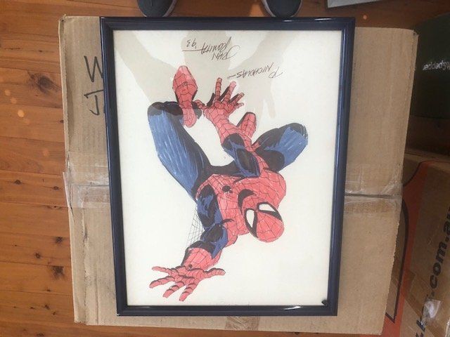
Here's someone from Sydney, Australia named 'David Richardson' selling a Romita Sr (incorrectly identified by him as Romita Jr) color Spidey, framed, from 1993. He joined the group three weeks ago; his Facebook account has posts since 2017. Different guy? https://www.facebook.com/groups/100761773610059/user/100010051785240/ It says "To Nicholas" but he says Romita did it specifically for him.
-
The 130 page was tempting. A key moment in the Dark Phoenix story.
-
Decorating the Morlock Tunnels: Art under $500
RBerman replied to RBerman's topic in Original Comic Art
Hey ho, it's time for some more cheap art in my favorite category, "detailed pencils." First a pair of Yvel Guichet pages from the 2012 iteration of Stormwatch. They're both "gathered around the conference table" scenes, but not from the same issue. Next, an undated pair from Joe Phillips which I suspect are unpublished try-out pages in which two villains tear into some sky-cycle cops. And next, an unusual look at the Marvel Bullpen circa 2014. The artist is evidently named Kevin Snyder. And finally, Adriano Batista's cover to Jungle Girl Season 2 #5. Or rather, a perfect 8x12 recreation of the 11x14 published cover. I have great difficulty telling the two images apart except for their size.


-
His Micronauts work was excellent. I am on his list somewhere as well.
-
Decorating the Morlock Tunnels: Art under $500
RBerman replied to RBerman's topic in Original Comic Art
I was pleasantly surprised to find that Terry Moore still had Rachel Rising pages available. This one not only advances the story of Rachel discovering she is undead, but also functions as a one page gag.
-
When Heritage was offering all those early 70s Swanderson pages over the last couple of years, I got a few, all from issues I had actually read as a kid. I can't say those pages are objectively better or more valuable than the ones i passed by. Indeed, I stopped bidding on some precisely because their value to somebody else was more than I was prepared to pay.
-
Manuel Alves on Facebook.
-
I don't want this in the dealer's "for sale" listings forever, any more than I want a car dealer's lanes filled with blow-up balloons representing the cars he already sold. But I do agree that an aggregated record of all past sales would be valuable, all on one web site somewhere. Just like those web sites where you can see what all the houses in your neighborhood previously sold for.
-
Decorating the Morlock Tunnels: Art under $500
RBerman replied to RBerman's topic in Original Comic Art
I have a few of Netho's pencil pages; it's solid work. -
This is why I stopped visiting the Romitaman site. The "new items" pages are clogged with sold art. Some dealers' CAF pages have a similar problem; they leave sold items in their "for sale" galleries, and you have to click on each page individually to discover whether it's actually available. Not worth it to look at dozens of pages that way.
-
Decorating the Morlock Tunnels: Art under $500
RBerman replied to RBerman's topic in Original Comic Art
At a small convention this past weekend, I got an ink wash page from indie werewolf book Night Wolf: And its spin-off Snow Paw:

-
I just like modern comic book art and don't find it all the same. I know that posting panels doesn't speak to Justadude's observation about page flow, but none of these are splashes.


-
I'm with the consensus here. As Sturgeon's Law says, "90% of everything is CR**" The sieve of time lets the old CR** fall by the wayside and be forgotten. But if you look at the new stuff, you'll see 90% CR**, and 10% awesome work that we'll still be talking about years from now when someone is complaining about how boring the new stuff is. As a collector, there's more new stuff I like than I can afford, even though it is less expensive than the old good stuff. ETA: That vulgarity filter is hilarious.
-
Decorating the Morlock Tunnels: Art under $500
RBerman replied to RBerman's topic in Original Comic Art
A recent acquisition by the quirky Langdon Foss, from the "Vote Loki" 2016 book: And a 1988 Benn Dunn page from Ninja High School: And early 90s Brigade by Marat Mychaels and Marlo Alquiza:


-
ComicLink has now corrected the entry, citing you.
-
Best of 2022 Just hours left!!!! select your entries!
RBerman replied to Brian Peck's topic in Original Comic Art
I win the "didn't read the instructions thoroughly" contest. I only voted for one in each category, not realizing five were allowed. Can't be undone apparently. I'll try again next year! -
Voting booth for the Best of 2022 two days left to vote
RBerman replied to Brian Peck's topic in Original Comic Art
Two other modification possibilities: 1) There are separate categories for "Illustration" and "Other." I would think those could be combined since this is a contest for illustrations. As I look through the "other" category, most of the pieces look like they could reasonably have been put into a more specific category like "commission" or "illustration" or "cover" or "recreation. Speaking of which: 2) Specifically expand "recreation" to include "homage." Not all recreations are intended to be exact, like the "One Minute Later" series, or the "Calvin and Hobbes version of Silver Surfer #4." -
Voting booth for the Best of 2022 two days left to vote
RBerman replied to Brian Peck's topic in Original Comic Art
You're not crazy. The artist names were not on the voting page when I looked yesterday, but they are today, which is good. Also if you clicked on the title of the art (as opposed to the art itself), you went to the gallery page for that piece, where you could read about it but not "like" or comment on it. You have to go to the owner's regular gallery to do that. -
Voting booth for the Best of 2022 two days left to vote
RBerman replied to Brian Peck's topic in Original Comic Art
Many humans are inherently competitive. Years ago the computer in the break room at work had solitaire Mah Jongg on it. But since the game had a timer, solitaire inevitably became a competition. Metrics do that. CAF is great. I love using it and looking at other people's art. I enjoy other people enjoying my art too. But because I'm competitive, I also think about how many views and likes and comments I get. When I post a new piece I really like, I can't help wondering whether it will get featured in the weekly CAF update on YouTube. (This has happened once.) But watching the CAF update the following week, I can't say that my piece was more deserving than the ones that were chosen. That's how the awards are as well. There's so much great art out there that everybody needs to just take it in fun and not set any expectations of their art "winning." For me "winning" is just having my art featured next to some really cool pieces. (I'm going to keep reminding myself.) OK, if I get a few new likes and comments out of it, that's fun too. One thing that ought to change next year though: It seems to me that a few artists are using the "Best of CAF" contest just to publicize their own art. That's not really what this is for, and if that became more common, it could really clog the process of reviewing submissions. -
The January 2023 HA auction starting to load up
RBerman replied to batman_fan's topic in Original Comic Art
I agree, including Whedon/Cassaday being great. I like All-Star Superman, but the pencil art is difficult to see; the New X-Men pages look better in this form.

-
The January 2023 HA auction starting to load up
RBerman replied to batman_fan's topic in Original Comic Art
Pictures, or it didn't happen. -
March 2023 heritage signature auction
RBerman replied to drdonaldblake1's topic in Original Comic Art
And then came Necrosha.


