-
When you click on links to various merchants on this site and make a purchase, this can result in this site earning a commission. Affiliate programs and affiliations include, but are not limited to, the eBay Partner Network.


scburdet
-
Posts
5,398 -
Joined
Content Type
Forums
CGC Journals
Gallery
Events
Store
Everything posted by scburdet
-

Grade is in: Fantastic Four Annual 6
scburdet replied to scburdet's topic in Hey buddy, can you spare a grade?
Stains are the new bane of my existence now. Someone posted a ASM238 that looked great from the front, but had a substantial water stain on the back. So, I was compelled to show my Iron Fist 14 that has a small stain that's not obvious unless you're looking for it, and some light water stain on the back cover. Looks like it could have gone over 9, but landed at a 5.5 -
@SWTonyis it possible it's .heic file? I'm running into issues like this all the time these days when these appear as another file tyoe. It looks like this has to be old school jpg, gif or png extension to post
-
The next to last of my square bound books in the grading candidates pile. In some respects, this book look quite nice as square bound books go. Clean. Color rub around staples isn't pronounced. Of course, there are two obvious defects. The crease on the font cover and a scuff/?abrasion? on the back cover. Oh, what could have been. This is one of the areas where I have the most trouble b/c the grades <7.0 seem less objective with terms like "moderate" and "several" being not well-defined enough IMO. I would say this is a very attractive book (if you put your hand over the top right corner and don't pay too much attention to advertisements), but I fear there's no escaping some low grade.


-
PGM: Amazing Spider-Man 4 (2014) 1st Silk
scburdet replied to SWTony's topic in Hey buddy, can you spare a grade?
IDK about anyone else @SWTony but I am not seeing photos on either of your posts. I don't have enough experience with these forums to give you a reason. -
PGM Marvel Super-Heroes 18
scburdet replied to scburdet's topic in Hey buddy, can you spare a grade?
🤞 I could live with that. @mars76 -
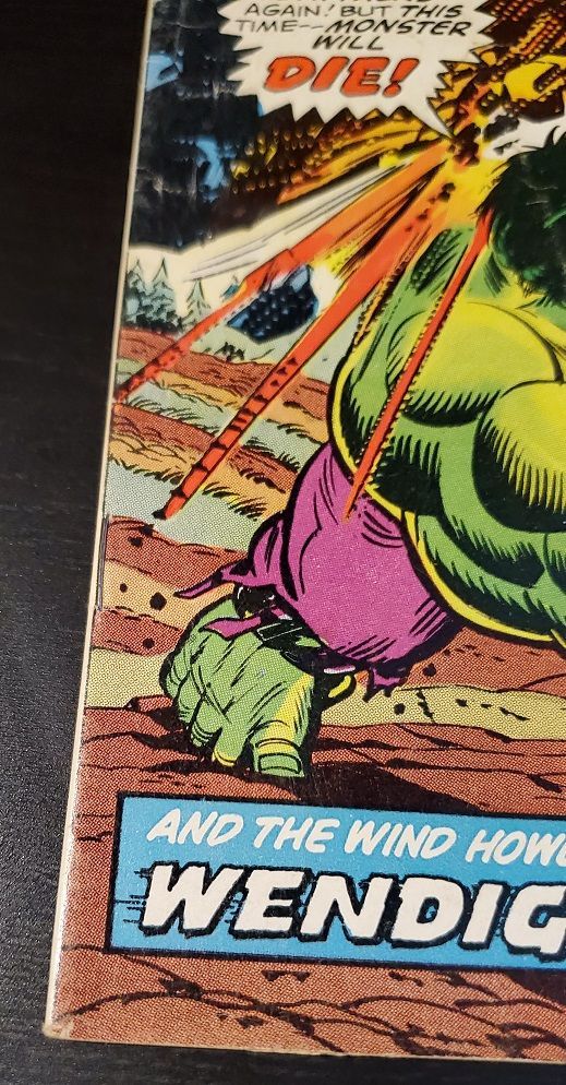
PGM Incredible Hulk vs Venom - Grade is in!
scburdet replied to Jemin's topic in Hey buddy, can you spare a grade?
My experience with these card-stock covers is good at CGC (n=2). I don't think pressing will do much with them, but I'd be interested to hear about anyone's thoughts. I'd guess the textured cover shouldn't be pressed anyway. Nevertheless, I think you're as good as it's going to get as is. 9.2-9.4, I tend to expect the former, but wouldn't be surprised with the latter. -
I wasn't so impressed with this book, but editing the photos maybe I shouldn't be as disappointed? IDK. A little color rubbing and the stress lines (do we call them that in a sq bnd book?) are the main issues I see. It looks like the prices on mid-grade copies are down for now. Maybe they'll jump again when the 3rd movie comes out next year. Not that it changes my plans per se, although it might be a difference in CGC grading tiers if GoG get hot again.


-
PGM Superior Spider-Man Annual #4
scburdet replied to Ian callaghan's topic in Hey buddy, can you spare a grade?
I see a possible ink splatter under the title. I've been told these don't count against you unless you're in the +9.6 range. That discoloration along the right side of the front cover is likely going to be the issue. It's reminiscent of some GI Joe issues I posted here recently where folks cited some possible paper oxidation, but I think they were counting this as a moderate defect. I'm going to guess 8.5±0.5 depending on how the severity of that discoloration is treated. My guess is that you won't get as much leniency with a book from 1984 as one from the late 60s or early 70s. -
PGM Amazing Spiderman 300
scburdet replied to Sebastsk8's topic in Hey buddy, can you spare a grade?
8.0±0.5, those little tears will probably be what drops you down. It does look an order of magnitude better than my copy, which I haven't been able to bring myself to post -
Looks 9.4±0.2. It seems to me that one of the corners is slightly dinged so unlikely to hit a 9.8. It doesn't look to me like the market is especially strong with a TV show coming out, so maybe $100 or so profit after fees? I'm not plugged into the gaming community, but I think the grading payoff will depend on if the show is good/popular. I feel like the video game to TV/movie adaptions are very hit and miss, and mostly the latter. Of course, if the show gains steam like a Walking Dead and you hold to the right time, you could do much better.
-
PGM West Coast Avengers 46 - Grade is in!
scburdet replied to Jemin's topic in Hey buddy, can you spare a grade?
I see 1/2 dozen small stress marks on the back. I don't see any equivalent issues on the front. I'll go with a 9.0, but it looks better from the front -
A lot more people hanging out here on a holiday than I would have guessed. I'm down to 4 (more or less) square bound books in my pile of CGC candidates. Here's Silver Surfer 3. It has decent eye appeal except there are spots here and there in the red. I guess those are color rubs, but it doesn't look like the typical ones on other books. IDK if this could be something else? Pretty sure it's not staining of any kind.


-
PGM ASM 175 *GRADE IS IN*
scburdet replied to WilliamLunt's topic in Hey buddy, can you spare a grade?
I mean, if the label didn't say it, how would you know that giant green statue wasn't some other iconic NY landmark? I love these early Punisher books. -
@grendelbo @MrRoboto The one thing you can't tell from the photos is how the book feels to the touch. IDK how "old" a book has to feel for it to impact the grade, but when you handle it, there's not question that it's from the late 60s.
-
I don't want to bias the jury, but I was never satisfied with this book's conditions after I got it. I know it's a more recent purchase than a lot of the mid-grade key books I've shared, but bought before 2020 at least. I didn't even have it in my grade-able box, but it seems like the prices on this one have gotten a little crazy. The prices are a bit all over the map, but there are some <4.0 sold on ebay that I would not entertain paying those prices for something that's not a first appearance. Maybe it's just an insane bubble that will burst after the next BP movie. Trying to see if I should adjust my priors on grading. Thanks in advance.


-
PGM Strange Tales #169 (1st Brother Voodoo)
scburdet replied to Engr62's topic in Hey buddy, can you spare a grade?
I am excited about getting my ST169 back (end of Aug?). The staining & tear I would thing relegates this to no better than a 5.0, but there there are a variety of other dings, so I would set this at a 4.5. 4.5 vs 4.0 is slightly below average vs below average. I would say this is slightly below average (4.5) instead of below average b/c it still looks relatively nice to me. This seems to be the less objective part of grading. -
1.5/1.8 I think. It's hard for me to see this getting to 2.0 with all the separations & tears. Seems like it's complete, so I not sure it would be justifiable to come in lower that 1.5.
-
PGM Tales To Astonish 91
scburdet replied to Cyborg-Sinister's topic in Hey buddy, can you spare a grade?
I do love this book. Same for me when I saw it in a bin (this one is nicer I think). I'm interest b/c you have some fraying along the edges, which is pretty typical and a lot of my books from the same era have varying amounts of this. Other than that, the white areas could use some cleanup if possible and there are only a few ticks along the spine that aren't too bad. Starting bid is 7.0 and I could see as high as 8.0 depending efficacy of C&P. -
The reflection makes it look worse, but that's real defect. It's similar (and almost in the same place) as what's on the 181. This is not quite as bad as the 181 IMO (https://www.instagram.com/p/CeymPPtr1Us/). I had been worried it would drag the other grade way down, but the pressing at least made it presentable I suppose.
-
The copy is not nearly as nice as the one that was posted several days ago, but what can a guy do? I bought this quite a while ago advertised as NM (along with 181 & 340). Long story short, once I had them in hand I could tell that was a wildly inaccurate grade. To give you some idea of how long ago this was, the asking price was in the ballpark of $300 for the lot, and I walked away having paid <$150 after a buyer protection claim. Smash cut to ~5 months ago, I got around to sending the 181 graded and it came back at 6.5 after C&P (Cert # 4061365005). What say you, do I have a chance of getting a 6.5 on this one? The 181 had some scuffing along the spine and on the back cover, I think this one is better in that regard. The little creases at the corner may be a bit more noticeable here. No C&P on this yet, but it's obviously part of the plan. Not a collector as an investment person, but this one has had good ROI.


-
PGM Amazing Spider-Man 129
scburdet replied to ivrimark's topic in Hey buddy, can you spare a grade?
If you never turned the book over, I could buy getting a 7.0-7.5 after C&P. I'd defer to those who had books like this to comment on the efficacy of C&P on the reverse, but I have a hard time seeing it being completely pressed out. My guess is 6.0±0.5. A 4.5ish is probably the right as-is number. -
2022 CGC Grading Contest Season 1 Summer Edition (#3) Sign-up Thread
scburdet replied to CGC Mike's topic in Comics General
Finger bends!!! SO MANY FINGER BENDS! -
I was going to participate in a Captain Marvel 26 challenge on here until I reexamined my copy and found a smallish but noticeable water stain on the back cover, so instead I bring you War is Hell 9 for fun. This is clearly the *most important* appearance of Death in Marvel Comics. I mean, if it wasn't the most important, would they have put her on the cover? Twice?!? This one is in my category of underappreciated comics and really not valuable enough to be a great CGC candidate. Still, I almost sent this for a Claremont or Thomas signature before deciding against it b/c I had too many for them already. Tony Isabella is still around, so I suppose that would be another possibility. Secondary question to the grade, who would you choose? Sadly, all the artists have passed on now but this is a really well drawn book IMO.


-
Is the reader's crease you see in the bright area parallel to the spine? If so, you're right that there's something there. The glare makes it look a lot worse, it's faint, so I hope that will be amenable to pressing.
-
I've very interested in the staple issue in square bound books as I seem to have a lot of key square bounds and this is a consistent defect. I actually haven't paid too much attention to What If 10s, but here's an example in a Marvel Feature 1 w/9.6 where the solid color behind the staples makes it quite obvious there's a color rub related to that (CGC Cert # 3768960006) and it's not in the graders' notes. I'm looking at a 9.8 What If 10 sold on ebay where I can clearly see the staples pushing up in the holder, but no color rubbing. It's a very interesting issue. If I ever acquire the time stone, instead of righting some historical wrong, I'm going to travel back in time to yell at the Marvel EIC about putting out books in square bound form.


