-
When you click on links to various merchants on this site and make a purchase, this can result in this site earning a commission. Affiliate programs and affiliations include, but are not limited to, the eBay Partner Network.


Silverdream
-
Posts
692 -
Joined
-
Last visited
Content Type
Forums
CGC Journals
Gallery
Events
Store
Posts posted by Silverdream
-
-
No, it never went anywhere. I thought the baby was alive, the dr/nurse was being paid by Osborn to lie to Peter/MJ and give the baby to him.
Kinda to keep a newborn baby from taking its first breath, which is a huge cry.
I just got the feeling Osborn had her kill it and there was going to be some DNA thing going on with it...ugh... heh.
-
Not really, Im just a fan and have all his copper books, that's the only one Im missing.
Yes, Art took forever on books, but for art's sake (no pun intended) it was well worth it and always well received. You can clearly see a difference in his art from his really early books (Xmen annual 9,10 lets say to X men annual 14). Each panel used to be packed with details and amazing texture renderings. It got a little sloppier with late copper - modern issues, but that's probably because he couldnt meet his deadlines. Theres nothing wrong with taking your time in perfecting your work, if the results are well worth it.
New Mutants Special #1 and X-Men Annuals #9 & #10 are sumptuous banquets for the eyes. Every page is a masterpiece, a delight to behold, and each time, there's something new to see.
I pick up NM Special #1 whenever I can. Not only is it a tough, tough book in 9.8, but it's criminally cheap.
Longshot was his first mainstream work, so it's a little sketchy, but by 1985-86, he was producing masterpieces. By 1990, it was pretty much over. I think his last really great work was X-Men Annual #12.
I wish he still did, but I'm not sure he can anymore.
Every word my friend, every word
This doesn't happen often, but I am in complete agreement with RMA on this one.
-
I don't have a problem with them steal...err... posting stuff like this but at least give some credit. They act like they came up with it themselves and it's not the first time.
The BC article says the baby was born stillborn. Is she not alive when they hand her to Osborn? Did they even read the book or just glance at a wiki about it?
Well, they tell MJ its stillborn, but I don't know what happened with this storyline. Was it? Did they every do anything with this story? I re-read 418 for the heck of it, but didn't get much out of it.
-
Posting this here, as it is relevant:GORGEOUS!

 I am not going to tell him he is mistaken, but somewhere along the lines maybe Marvel said lets do a 3rd and then changed their minds.
750K is a number we need to remember down the road because this book is going to get hot soon and be another big Marvel book in a year or two. I have to tell myself that occasionally because I have amassed a few nice copies.
Thanks for sharing that information.
Why are we taking this for grail when he said there were 3 printings?
Emberlin is mistaken.
Not only did the book NOT go to 3 printings, it did NOT sell 750,000 copies.
Common sense has to be used: 750,000 copies sold would mean that there were roughly 900,000-1 million copies printed, because the newsstand always returns *something,* Amazing Spiderman has *never* even come CLOSE to printing a million copies of ANY issue. And if they had printed a million copies, there would have been plenty of copies in circulation to more than cover demand...which means they wouldn't have gone to a second printing.
It must be remembered that this book was printed and on the stands in February of 1992. Now, granted, there had been crazy printruns....at the time, they were printing a million copies of Jim Lee's X-Men...but in February of 1992, McFarlane was long gone, and Amazing had simply been chugging along. Carnage was simply another character which took the comic buying public by surprise, which resulted in sellouts (read: not enough copies to go around) and an immediate second printing of not only #361, but #362 as well.
Immediate second or more printings always means that they didn't print enough in the first place.
They probably sold around 350,000-400,000 copies, which is nothing to sneeze at, but not anywhere near 750,000, which would have been more than the entire print run plus another 35% or so.
Look at the numbers: the numbers for two years had been in the 350,000 copies sold range. The SOO printed in #360 (which would have covered up to about issue #356, so only a few months before #361) shows a sell-through of 340,000 copies, on a just a bit less than 500,000 total print run. Nothing would much have changed going into #361.
And so, not only did you have unmet demand (which means they didn't print enough copies) and a sellout for #361, but you also had the same situation for #362, and both went to a second printing shortly after #363 came out.
INCLUDING the second printing, total copies for #361 probably sold in the neighborhood of 500,000 total copies.
Then, the next year, the SOO in #375, you see a big jump...and this makes sense, considering in that year you had the madness of Carnage, PLUS the 30th Anniversary hologram covers, which were also a huge hit. It was a big year for Spidey, and orders steadily increased throughout the year, in concert with the general ramp up in the entire industry.
It would be another full year before print runs got totally ridiculous, and this was reflected in Amazing Spiderman as well (which is why copies of #375 are EVERYWHERE.)
For reference:
http://www.comichron.com/titlespotlights/amazingspiderman.html
ASM 361 didn't take many people by surprise. As shown in one of my other posts, they were building up carnage in each issue showing the cover for 361 in the letters page of 359, and at the end of 360 it touts the next issue as " Spidey meets the SPAWN OF VENOM!! " Also, 361 featured the return of Mark Bagley who had taken a few issues off, they announced that at the end of ASM 360 as well. He wasn't McFarlane, but he was very popular.
The other thing nobody has mentioned, ASM 361 is listed as the 207th most ordered book of 1992. Ok that was mentioned. What wasn't mentioned was that ASM 360 was #244 on that list. That's quite a large jump for one issue right? Why is that? hmmmm oh yeah because Carnage and 361 was not a surprise.
ALSO!! ASM 370 is listed as #211 in sales for 1992. Wait! ASM 361 was ordered more than the glut era ASM 370 and had nearly the same orders as ASM 371 which is # 204?? How could that be? Oh right, ASM 361 was not a surprise, it was ordered heavy.
Well, I guess it was still a surprise because it still sold out and retailers we left going holy im going even bigger on the next issue, ASM 362 shows as the # 183rd book of 1992 and ASM 363 just simply blew up being ranked # 113. And after that? ASM 364 dropped to # 187 ... less that 362. Why? Because just as the carnage story starting in 361 was no surprise, the fact that 364 wouldn't have venom or carnage was not a surprise either.
There is a reason most collections of ASM I purchase from original owners have 1-2 copies of each, then 3-5 of 361 and 362 and then like 10 copies of 363. Its the same reason MY collection looks like that. Its the same reason the yearly sales rankings for diamond show the same pattern. If we had Capitals rankings, it would shape up the same way.
ASM 361 was ordered just as much as ASM 370 and 371. That should tell us enough. ASM 371 had about 600,000 copies printed with 120,000 estimated returns* ( explanation at the end) REMEMBER ! ASM 361 sold out, leaving many collectors hopping around 7-11's and book stores trying to find copies. The returns on 361 would have been MUCH lower because of the sell out.
My estimate for ASM # 361 looks like this 600,000 copies printed with 60,000 in returns. 540,000 copies floating around. Still much less that 750,000. Way more than 350,000-400,000.
My
 Take it for what it is.
 *** The estimate of 600,000 copies printed for ASM 371 is based on the SOO from ASM 375 which states actual print runs for the issue closest to filing date of October 1, 1992 is: 595,700 copies printed minus total copies not distributed 129,350 this = 466,350 copies of ASM 371 actually sold.
The reason ASM 371 can be targeted as the closest issue to the filing date is because the SOO is for Marvels January- December COVER dates. They filed each year in October because back then they solicited the books 3 months in advance. The SOO is printed in ASM 375 because the SOO is required to be printed in the first book of the new year. ASM 375 has a march cover date, but was released in January of 1993. I hope this makes sense.
-
Yeah, I agree both books should pick up.
Argument can be made #360 is his "First Appearance".
My #360 slab doesn't even have a Carnage note at all.
360 now lists " 1st appearance of Carnage in Cameo on last page"
Totally wrong since the appearance is in the middle of the book, and he had an appearance in 359.
-
Carnage's first appearance is very muddy because of how they lead up to 361. It goes like this.
ASM 344 First appearance of Cledus Kasady , Eddie Brock's cell mate who becomes Carnage. Major Key when it comes to Carnage. Carnage is the Alter Ego, albeit a villain. This is the characters first appearance.
ASM 345 Second Kasady. The symbiote breaks Brock out of jail and leaves a drip of itself left over, foreshadowing it combining with Kasady. This issue is listed as Carnage's origin, because it is.
Large 1 year gap between appearances.
ASM 359 This book is huge because it is the first time Kasady has obviously already combined with the symbiote. He is talking to it, using the word "we" a bunch. He attacks a guard from his cell, and we can clearly see the red symbiote coming from him. One the letters page of 359 we are shown a cover preview of 361.
ASM 360 On Page 13 Carnage appears, calling himself Carnage and killing another person.
ASM 361 You know the deal on this one.
SO....
In my book ASM 359 is the first appearance of Carnage in Cameo ( unnamed )
ASM 360 is the first appearance of Carnage. ( Named )
ASM 361 is the first cover appearance of Carnage.
ASM 361 has been shoved down so many peoples throat I doubt the general comic collector will care about 359 or 360. Plus everyone wants a cover intro, so its easy to ignore the previous issues.
This isn't quite as simple as Hulk 180/181 or ASM 299/300 with a cameo on the last page.
Not that any of this matters, because the print run for ASM during this time was Half a million copies each issue, with 361 being closer to 600,000
-
From my understanding Longshot # 1 is his first pro work.
It may have been released after some other published work, simply because he took FOREVER to complete longshot.
If you are looking for difference in style, I wouldn't expect it, since Longshot 1 was very early.
-
Yeah im away at work atm but as soon as I get home ill do some high res scans of it. I do intent to transfer it to CGC. I don't mind if it comes back as a green label. Hopefully the grade stays up there
 , I actually intend on trying to get the signatures resigned over by the artists so they can be verified. As for the grade I did some research and found this......
http://community.ebay.com/t5/Comics/Does-PGX-Rating-Bring-Down-The-Value-Of-A-Comic/td-p/2889416
Found it very helpful.
Interesting thread with plenty of butthurt. Thanks for posting.
Yeah I've had books repeatedly downgrade sometimes significantly from PGX to CGC. As such I will never buy one again. The chances of a "10" book in a PGX slab turning into a CGC "10" are zero. I normally don't like to speak in absolutes. This is one time though I feel it's appropriate.
I would be interested to see the results of having a creator re-trace a signature in front of CGC to go for a yellow label though.
Of course the third option is just leaving at is. Or cracking it and sticking it in a mylar if PGX labels turn your stomach.

-J.
Not sticking up for PGX here but ... wow
Such a fanboy!
CGC's 10's are mythical creatures, only showing up once every hailey comet cycle. Resubbing a CGC 10, without CGC knowing about it and getting another CGC 10 has a zero chance as well. If you really think CGC can tell apart 9.8's -10's each time they grade them, I don't even know what to say.
Ive seen CGC books cracked and resubbed with NOTHING done to them and the grade jumping 2-3 full points, check the forums if you don't believe me.
CGC's grading is flawed as well, just listen to the boards, people talking about the " soft 9.8 years " . Get over it. Yes CGC is better. Stop making them out to be gods.
Seriously dude. Wtf was the point of all that?

-J.
What was the point of what you said?
Don't ask silly questions.
Bash PGX all you want, they deserve It for many, many reasons, sadly, grading has always been the least of their problems. Resto check and detection of manipulation like married pages , hair in their slabs, and many questionable dealings with " inside" people have been their problem.
NEITHER company has ever been consistent when grading the same books more than once, while not knowing about it. Its all over the place for both.
The point you ask about? CGC cant even tell their own 10's from 9.9's or 9.8's most of the time. Your delusional if you think they can. To trash PGX because their 10.0 wont come back a CGC 10.0 is illogical, because CGC's 10.0 wont come back a CGC 10.0 a second time either.
Sorry to hear about your downgrades from PGX to CGC, if you dig around on the forums, you will find posts of PGX books being subbed to CGC and getting upgrades that will make you laugh.
-
Yeah im away at work atm but as soon as I get home ill do some high res scans of it. I do intent to transfer it to CGC. I don't mind if it comes back as a green label. Hopefully the grade stays up there, I actually intend on trying to get the signatures resigned over by the artists so they can be verified. As for the grade I did some research and found this......
http://community.ebay.com/t5/Comics/Does-PGX-Rating-Bring-Down-The-Value-Of-A-Comic/td-p/2889416
Found it very helpful.
Interesting thread with plenty of butthurt. Thanks for posting.
Yeah I've had books repeatedly downgrade sometimes significantly from PGX to CGC. As such I will never buy one again. The chances of a "10" book in a PGX slab turning into a CGC "10" are zero. I normally don't like to speak in absolutes. This is one time though I feel it's appropriate.
I would be interested to see the results of having a creator re-trace a signature in front of CGC to go for a yellow label though.
Of course the third option is just leaving at is. Or cracking it and sticking it in a mylar if PGX labels turn your stomach.
-J.
Not sticking up for PGX here but ... wow
Such a fanboy!
CGC's 10's are mythical creatures, only showing up once every hailey comet cycle. Resubbing a CGC 10, without CGC knowing about it and getting another CGC 10 has a zero chance as well. If you really think CGC can tell apart 9.8's -10's each time they grade them, I don't even know what to say.
Ive seen CGC books cracked and resubbed with NOTHING done to them and the grade jumping 2-3 full points, check the forums if you don't believe me.
CGC's grading is flawed as well, just listen to the boards, people talking about the " soft 9.8 years " . Get over it. Yes CGC is better. Stop making them out to be gods.
-
This one hasn't heated up yet, but What if 105 first May Parker could be one to get now before Spider-verse is over. Also Amazing Spider-man 30 first Morlun, great Campbell Cover and sleeper for sure.
does anyone know the issue where peter and mjs baby was born?
ASM somewhere in the 4-teens I think.
What if 105 has always been a hot issue, pulling 2-4x the issues around it. It heated up long ago and stuck. It could blow up of course, just letting you know this book always had interest.
ASM vol2 # 30 has always had hype , but it has never really done anything. There have been 2 cgc 9.6 copies that sold for under $25 each this month alone. This one could blow up for sure, but im bored of hearing about it.
I just read ASM 418 again could barely get through Skroce's pencils. Anyhow, Did they ever name their baby? They had a nursery and everything. I didn't see a name given in 418, MJ just kept saying " my baby". Whatever happened with the baby anyways? I know Norman Osborn took the remains, but what happened with it, I don't recall.
-
I'm a bit confused with the reaction to the Spider-Woman Manara variant. Were collectors thinking this was going to be a virgin cover (no logo)? If not, then where else could Marvel put the logo? Her body pretty much covers (vertically) the entire cover.
Sorry for any ignorance on my part or if this was previously answered.
Meck
I think people expected marvel to accommodate the artwork properly.
Marvel has been very liberal with where they put the title logo recently, either having the artwork go " over" the title, or making the logo smaller, or shifting it to one side, even at the bottom at times. In some cases making the artwork slightly smaller so its shown fully. It's not like it use to be where the logo stayed in the exact same spot for years on end.
They made no attempts to accommodate the art. All they had to do was shrink the image by 10% shift the title up and to the right, like they did on the Oyum variant and you would get most of the art. The could have also shrinked the art 10% and just threw the title to the bottom, they have done this before. They did none of this and planted the title right on top of the " controversy".
Looking at the milo variant, it's pretty darn obvious they were trying to cover up her rear. Its so obvious its laughable. I imagine the person in charge of the overlays just floating the title around saying things like " oops, too much crack, a little to the left"
Suggesting that it could be shrunk 10% assumes that the piece was not created with the final dimensions of a comic book in mind. If you shrink it, then the art doesn't reach the trim
This is the digital age. They could have made it happen, that's all im saying.
I'm glad you're not one of my clients. The computer is not a magic box. You can only work with what you have to work with. It's highly unlikely that the artwork was created with a significant amount of bleed, so shrinking it down 10% would leave a gap at the edges. So unless Marvel is going to invest the time to extend the image digitally so fanboys can ogle Spider-woman's , this is not a realistic course of action.
I cannot speak to what you are saying because I am not an expert. If you are an expert, kudos to you and I stand corrected. I have seen all sorts of layouts on covers, so I was assuming they have a lot of control over the process regardless of artwork size. I guess they are just investing time into some covers? To be clear, I think they should work on all images to accommodate the artwork, Not for any particular reason for any one cover, like you wisecracked about, but for all cover art. I think its insulting to the artist what they did here, as I would if they covered up any artwork like this. It's sloppy, and lame.
That still does not take away that they intentionally placed the logo to cover it up. They can do whatever they like with the logo's, I have provided proof for that already.
It's highly likely Marvel would have provided Manara with a Photoshop file of the cover layout, with shows the placement of the logo, barcode box etc. Manara used watercolours for this piece, so from the outset that's not a digital layered file that can be broken up and moved around easily without repainting. Even using the clone tool in photoshop isn't an easy fix due to the textures. Manaras scanned artwork would then be placed within that Photoshop template.
That's why I said in a post above, that that placement of the logo could always have been the intention, yet Manara decided to go for the cheeks spread bum pose because he knew he could get away with it because it would be covered by the logo anyway. But Marvel released the raw image, and thats when the story took off.
You sound like you know what you are talking about, so I will give you a nod on that technical stuff. Sounds like they couldn't do much with layering. Sizing I still wonder about.
As far as the logo goes, only Milo could answer those questions. My speculation is, he wanted his image shown, but a hand higher up forced the logo to be placed over his artwork.
I highly doubt Milo went into that painting thinking " ahah! I will create a controversy with this butt pose, and it will just be covered up LOL".
There is no logical reason he should have thought it would be a problem. There are MANY covers in recent years that are just as racy as this one. This one just got attention, probably because its Spiderwoman # 1 and not some random Xmen issue.
Heck, his Uncanny X-force # 5 variant from last year is pretty racy. Notice how they didn't cover up psylocke's face with the logo on this one.

-
I'm a bit confused with the reaction to the Spider-Woman Manara variant. Were collectors thinking this was going to be a virgin cover (no logo)? If not, then where else could Marvel put the logo? Her body pretty much covers (vertically) the entire cover.
Sorry for any ignorance on my part or if this was previously answered.
Meck
I think people expected marvel to accommodate the artwork properly.
Marvel has been very liberal with where they put the title logo recently, either having the artwork go " over" the title, or making the logo smaller, or shifting it to one side, even at the bottom at times. In some cases making the artwork slightly smaller so its shown fully. It's not like it use to be where the logo stayed in the exact same spot for years on end.
They made no attempts to accommodate the art. All they had to do was shrink the image by 10% shift the title up and to the right, like they did on the Oyum variant and you would get most of the art. The could have also shrinked the art 10% and just threw the title to the bottom, they have done this before. They did none of this and planted the title right on top of the " controversy".
Looking at the milo variant, it's pretty darn obvious they were trying to cover up her rear. Its so obvious its laughable. I imagine the person in charge of the overlays just floating the title around saying things like " oops, too much crack, a little to the left"
Suggesting that it could be shrunk 10% assumes that the piece was not created with the final dimensions of a comic book in mind. If you shrink it, then the art doesn't reach the trim
This is the digital age. They could have made it happen, that's all im saying.
I'm glad you're not one of my clients. The computer is not a magic box. You can only work with what you have to work with. It's highly unlikely that the artwork was created with a significant amount of bleed, so shrinking it down 10% would leave a gap at the edges. So unless Marvel is going to invest the time to extend the image digitally so fanboys can ogle Spider-woman's , this is not a realistic course of action.
I cannot speak to what you are saying because I am not an expert. If you are an expert, kudos to you and I stand corrected. I have seen all sorts of layouts on covers, so I was assuming they have a lot of control over the process regardless of artwork size. I guess they are just investing time into some covers? To be clear, I think they should work on all images to accommodate the artwork, Not for any particular reason for any one cover, like you wisecracked about, but for all cover art. I think its insulting to the artist what they did here, as I would if they covered up any artwork like this. It's sloppy, and lame.
That still does not take away that they intentionally placed the logo to cover it up. They can do whatever they like with the logo's, I have provided proof for that already.
-
My crystal ball tells me that this is the same person consigning books through MCS and setting ridiculous prices.
Quite true. Decent VF or better copies of this book are selling for $20-30.
However, since ebay is pretty much sold out otherwise, there is definatly something going on with this book.
-
Looks like the NM87 shiller is at it again on eBay. Apologies for being redundant with this, but the shill is obviously looking to inflate the price. With the traffic this site gets, I figured it'd be helpful to buyers and counterproductive to the shiller to point out manipulation when it's present.
Ah yes, how dare someone hit the eBay/MCS BIN price... Ruining it for everyone to purely inflate the price!

Are you saying that somebody trying to manipulate prices and screwing with people who are trying to sell their items isn't any kind of problem?
How do you know it's just 1 person? Maybe people actually want the book bad enough to pay a premium for it
I've had four nonpaying buyers. A couple of the usernames are the same that hit the BIN for MCS and did not pay. Conan at MCS confirmed this and has also reported the NM87 NPB sales to GPA. Before bringing it to light, I confirmed that other sellers were experiencing the same problem, as to rule out it being an isolated incident.
Every few days, somebody will set up a new eBay account(s) with a fake AOL email address and pick off all the NM87 9.8s in a row. I've contacted eBay three times, and I've been told repeatedly there is nothing they can do.
Rob Liefeld apparently has a lot of time on his hands these days...
If this happens again, I would check to see which NM 87's in 9.8 are still for sale. could be someone trying to make their copy be the only one for sale? Pretty big waste of time if you ask me, but who knows.
-
I was bagging some books from 1998-2002 the other night, and I came across Avengers #19, with a creepy red Ultron cover. It is actually part 1 of a storyline called "Age of Ultron." It centers around Black Panther, Wakanda and Ultron, although it does have extraneous characters like the synthezoid that is based on Bobbi Morse's brain waves. But as more details come out about the plot, this may heat up.
Back on topic!
This was one of my favorite Avengers stories from the second series.
I actually think 22 has the better cover. It was also called Ultron Unlimited, not age of Ultron, if im not mistaken.
I do think you are right with Black Panther being a large part of this 4 issue Ultron Story, they could be taking much of the movie ideas from this arc, which could mean heat.


-
I'm a bit confused with the reaction to the Spider-Woman Manara variant. Were collectors thinking this was going to be a virgin cover (no logo)? If not, then where else could Marvel put the logo? Her body pretty much covers (vertically) the entire cover.
Sorry for any ignorance on my part or if this was previously answered.
Meck
I think people expected marvel to accommodate the artwork properly.
Marvel has been very liberal with where they put the title logo recently, either having the artwork go " over" the title, or making the logo smaller, or shifting it to one side, even at the bottom at times. In some cases making the artwork slightly smaller so its shown fully. It's not like it use to be where the logo stayed in the exact same spot for years on end.
They made no attempts to accommodate the art. All they had to do was shrink the image by 10% shift the title up and to the right, like they did on the Oyum variant and you would get most of the art. The could have also shrinked the art 10% and just threw the title to the bottom, they have done this before. They did none of this and planted the title right on top of the " controversy".
Looking at the milo variant, it's pretty darn obvious they were trying to cover up her rear. Its so obvious its laughable. I imagine the person in charge of the overlays just floating the title around saying things like " oops, too much crack, a little to the left"
Playing devils advocate here; but the original artwork we saw left no room for a title. It's actually entirely possible that the logo was always going to cover her arse, but when the raw image was released thats when all hell broke loose. Perhaps a little bit of mischief from Milo.
I'm happy it's still being released anyway, I ordered it and it's a little bit of comics history. But I can completely understand why it's offensive to a lot of people.
All I'm hearing is excuses for marvel. Look people, it was done on purpose, period. They have the freedom to put the title logo anywhere they want, and any size they want, and this is the digital age, they could have done plenty to that artwork to make it fit.
Here, look at this: They put the title sideways and even moved the marvel logo from its normal spot so it doesn't cover up black cats " cheeks".

This one below they made the title logo tiny so everything fit.

Finally, almost all comic covers, the focus is the characters, they will almost always cover up the background art but not the character, they will let the character cover up the logo. As seen here.

Now look at this and tell me they couldn't have used some or all of the things they did to these above covers to accommodate the artwork and character image.
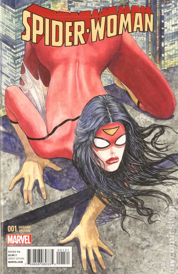
The simple fact is, the milo cover got heat on social media so someone up top decided to cover up the controversy, literally. It's NOT a coincidence.
-
I'm a bit confused with the reaction to the Spider-Woman Manara variant. Were collectors thinking this was going to be a virgin cover (no logo)? If not, then where else could Marvel put the logo? Her body pretty much covers (vertically) the entire cover.
Sorry for any ignorance on my part or if this was previously answered.
Meck
I think people expected marvel to accommodate the artwork properly.
Marvel has been very liberal with where they put the title logo recently, either having the artwork go " over" the title, or making the logo smaller, or shifting it to one side, even at the bottom at times. In some cases making the artwork slightly smaller so its shown fully. It's not like it use to be where the logo stayed in the exact same spot for years on end.
They made no attempts to accommodate the art. All they had to do was shrink the image by 10% shift the title up and to the right, like they did on the Oyum variant and you would get most of the art. The could have also shrinked the art 10% and just threw the title to the bottom, they have done this before. They did none of this and planted the title right on top of the " controversy".
Looking at the milo variant, it's pretty darn obvious they were trying to cover up her rear. Its so obvious its laughable. I imagine the person in charge of the overlays just floating the title around saying things like " oops, too much crack, a little to the left"
Suggesting that it could be shrunk 10% assumes that the piece was not created with the final dimensions of a comic book in mind. If you shrink it, then the art doesn't reach the trim
This is the digital age. They could have made it happen, that's all im saying.
-
I'm a bit confused with the reaction to the Spider-Woman Manara variant. Were collectors thinking this was going to be a virgin cover (no logo)? If not, then where else could Marvel put the logo? Her body pretty much covers (vertically) the entire cover.
Sorry for any ignorance on my part or if this was previously answered.
Meck
I think people expected marvel to accommodate the artwork properly.
Marvel has been very liberal with where they put the title logo recently, either having the artwork go " over" the title, or making the logo smaller, or shifting it to one side, even at the bottom at times. In some cases making the artwork slightly smaller so its shown fully. It's not like it use to be where the logo stayed in the exact same spot for years on end.
They made no attempts to accommodate the art. All they had to do was shrink the image by 10% shift the title up and to the right, like they did on the Oyum variant and you would get most of the art. The could have also shrinked the art 10% and just threw the title to the bottom, they have done this before. They did none of this and planted the title right on top of the " controversy".
Looking at the milo variant, it's pretty darn obvious they were trying to cover up her rear. Its so obvious its laughable. I imagine the person in charge of the overlays just floating the title around saying things like " oops, too much crack, a little to the left"
-
On the subject of covers, did anyone else see what they did to the
Manara Variant of Spider-Woman?? Cover her with a LOGO??? WTH, Marvel! Really?


You can see it here (sorry it's on BC..)
This is freaking hilarious.
Marvel would have never done this on their own, why would they care. Actually, they used to thrive thrive on stuff like this in the modern age, sex sells right? However, they are owned by Disney now, who is much more worried about " public image".
I am actually worried for Marvel books now. No more " sexy" covers at all because of Disney? Lame.
I know a lot of people who were looking forward to this book will be bummed, or pizzed or what have you, but I think its just a really cool part of comic history now.
I didn't want one before, I thought it was dumb, and didn't really care for Milo's cover, I actually preferred Siya Oyum's cover. Now I want one, just to tell the story. I'm going to print out the original solicitation and get a copy of this book. Cool coffee table story.
-
Cover I, All New Cpt. America someone pulling my leg?
http://www.midtowncomics.com/store/weeklyreleasebuy.asp?cat=61&wdate=11/12/2014&pl=281
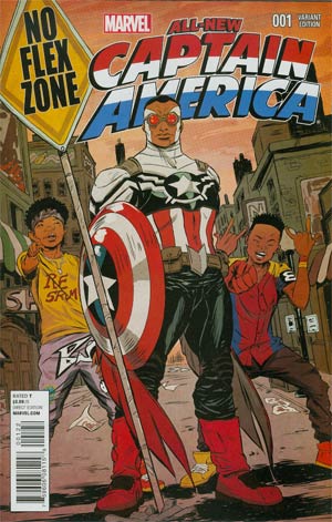
Sold out at $170, prob jimmy buying them up.
My LCS had one today for $49.99...I passed.

Sanford Greene did the cover and features the rap group Rea Sremmurd. No Flex Zone is their song.
And it's a one per Diamond Retailer Account variant... son
This cannot be true, I know if at least three places that received multiple copies.
No you dont.
If you say so.
Like most 1 per diamond account variants, the big guys get a few extra. Do you really not know this?
-
Cover I, All New Cpt. America someone pulling my leg?
http://www.midtowncomics.com/store/weeklyreleasebuy.asp?cat=61&wdate=11/12/2014&pl=281
Sold out at $170, prob jimmy buying them up.
My LCS had one today for $49.99...I passed.
Sanford Greene did the cover and features the rap group Rea Sremmurd. No Flex Zone is their song.
And it's a one per Diamond Retailer Account variant... son
This cannot be true, I know if at least three places that received multiple copies.
-


Darkhawk #1 CGC 9.8 @ $100 & 1 bid finally made the top ten list on Lyria as Most Expensive Graded Copper Comic on eBay today.

I sold mine a couple months ago for $115 off of E-Bay and people seem to get $125 or so on the boards. $100 would be low from what I've seen.
Smart move unloading a third appearance.
While the darkhawk preview is very arguable. Darkhawk # 1 will always be the book to own for him.
For anyone who collected during the time Darkhawk # 1 hit the stands, if they come back, and only buy one book, it will be Darkhawk # 1 hands down. It is like pure nostalgia on that book. It was one of the first " new" solo characters in the early 90's, and durning that speculation bubble, it was huge. He was going to be the new Wolverine. I think $100 is very sustainable. Sadly I only have my original two copies, both only in VF, and don't want to put up the $ for a 9.8 personally.
You are correct. Collector's will always want issue 1 over the Marvel Age comic and the Marvel Requirer comic.
I really like your placement of the word comic. I guess you could argue Marvel Age is a comic... at least comic format in size/staples. A preview comic if you may.
The Requirer however, is a comic shop news letter that is not comic sized, is not stapled. It is more like a newspaper. Calling this a comic just sounds desperate.
Calling the Requirer a comic may technically be wrong but I fail to see how it's desperate? I will tell you this though, I travel up and down the east coast hunting for comics and I see a lot of Darkhawk 1s in the trenches but hardly any Marvel Age 97s. At the very least it's a Darkhawk key. I'll tell ya what I'm desperate for, one of those comic newsprint publications by Marvel that just happens to be the first Darkhawk cover and appearance. I have never seen one.
There is one on the Bay right now brother, not looking hard enough.
I don't consider Ebay the trenches. I was talking about actual comic book stores.
Oh, well then of course you never see them in shops, they don't keep that stuff mixed in with comics. You would have to actually ask for their old newsletters if they kept any.
-
We all run around in circles when something gets optioned to maybe someday be a movie.
Whereas Disney's Big Hero 6 actually came out this weekend, got good reviews, and looks to be #1 at the box office. BH6 books are indeed selling at nice prices for a mid 90s marvel book, but I'm surprised we haven't had any talk about them here, or seen a spike in prices now that the movie has landed.
Any thoughts?
It will continue to get bigger with repeated viewings on Netflix and the Disney channel. I think the confusion is what is the real true first appearance,and the how the Dragon, Robot,or Marshmallow guy =Baymax.
What I find significant right now is the Baymax action figure is the number one best selling action figure on Amazon.com. Yep, Baymax is out selling Batman and Spider-Man action figures. This tells me Baymax is going to be huge like Groot.
The problem:
The Marvel source material is barely like the Disney material.
Exactly. Its seen a good uptick in price, but hasn't blown up because of that, and the fact they didn't make a new series to coincide with the movie.
It will grow as long as the movie holds up, its a 12 rounder imo, not a first round KO.
-
We all run around in circles when something gets optioned to maybe someday be a movie.
Whereas Disney's Big Hero 6 actually came out this weekend, got good reviews, and looks to be #1 at the box office. BH6 books are indeed selling at nice prices for a mid 90s marvel book, but I'm surprised we haven't had any talk about them here, or seen a spike in prices now that the movie has landed.
Any thoughts?
It will continue to get bigger with repeated viewings on Netflix and the Disney channel. I think the confusion is what is the real true first appearance,and the how the Dragon, Robot,or Marshmallow guy =Baymax.
What I find significant right now is the Baymax action figure is the number one best selling action figure on Amazon.com. Yep, Baymax is out selling Batman and Spider-Man action figures. This tells me Baymax is going to be huge like Groot.
The baymax in the comics are nothing like the one in the movie.
In Sunfire and big hero six he is a humanoid Robot that can transform into a dragon ( he is not a permanent dragon, He only fights in dragon form)
In BH6 2008 series he is a larger more rounded metal robot. Resembles the look more, but still not a marshmello.
I think the main difference is he is not the goofy battery dying laughable robot from the movie in ANY of the comics, no matter how he looks. He is actually very serious in the comics.
Regardless, Sunfire and Big Hero 6 # 1 is the first appearance, by over three months.
Read here.
http://boards.collectors-society.com/ubbthreads.php?ubb=showflat&Number=8000157#Post8000157


 Take it for what it is.


Copper Art Adams appreciation
in Copper Age Comic Books
Posted
His females have never been his strongpoint. He tries. His characters tend to come off cartoonish, which is fine with me, it becomes an issue when he tries to sex up a female, that ends up looking like a 12 year old.
His detail work is what's amazing.