-
When you click on links to various merchants on this site and make a purchase, this can result in this site earning a commission. Affiliate programs and affiliations include, but are not limited to, the eBay Partner Network.


Bronty
-
Posts
28,262 -
Joined
Content Type
Forums
CGC Journals
Gallery
Events
Store
Posts posted by Bronty
-
-
On a different note, I've been impressed with the prices realized on Groo OA lately.
Pieces from early marvel issues in the last signature did very well, and so did pages, in a recent weekly, from the Image series which in my eyes are much less desirable (although some of them did feature my favorite witches, Arba and Dakarba).
Maybe that makes a lot more sense than 9.8 destroyer duck 1's.
-
-
On 10/22/2023 at 3:40 PM, batman_fan said:
maybe unless I see another one I have to have
sounds like a definite maybe!
- batman_fan and alxjhnsn
-
 1
1
-
 1
1
-
On 10/21/2023 at 1:11 PM, batman_fan said:
This may be my last Charles Schulz pick-ups

that's terrific.
Last one?
Calling it quits?
-
I typed the words 'image size' into comic connect to get a filter on art that left out comics. I got 700+ hits.
Of the first 100 hits, 98 were graded 8.0 and 2 were graded 6.0.
It seems 8.0 is their default grade for art and 6.0 is how they let you know its had some damage to take notice of.
-
in HA's art grading nomenclature, excellent > very good > good.
As examples, HA graded:
- Secret Wars 8 page 25 'excellent' (more or less new looking, perhaps some very minor overall wear - in this case some very light toning)
- the What if #11 cover 'very good' (some typical wear and/or minor damage)
- Prince Valiant 214 strip 'good'. (more significant wear or damage. In this case, multiple tears/pinholes and other issues).
-
On 10/21/2023 at 6:19 PM, The Voord said:
Ha, ha, ha! Since when did they start grading OA? I always thought a general condition report should suffice, instead of going the route of slab mentality!
I haven't looked at comic connect's listings in a long time but I recall them just giving a few rudimentary grades, which is the same thing HA does.
The only difference is that HA's oa condition is words rather than numbers, which makes more sense for something like art. It conveys the condition without getting overly specific.
-
-
On 10/17/2023 at 10:50 PM, comicginger1789 said:
This lovely is on its way to me. Can’t say as I’ve seen one this nice for sale ever. Great cover too

congrats! I haven't seen that one before. What character is pictured there? Its quite a striking contrast to Archie.
-
its interesting seeing the various designs on these torture wheels. A lot of the wheels pictured on these covers just seem to dip the head into water or the body onto spikes or whatever when the wheel is turned. Seems more like a visual danger on the cover rather than depicting a torture device (why build a wheel if you are just going to drown someone or dip them in acid a la Mister Mystery 6?).
The ones that are more interesting/ sadistic and probably truer to life I imagine (?) seem to follow a formula - either hands or feet are affixed to something that does not move, and then the other half of the body is affixed to the wheel. And then as you turn the wheel you stretch the person a tiny bit at a time until they pass out / die etc.
The BP cover is probably the one that makes the device easiest to understand as the male has his feet fixed to the floor while the wheel pulls on his arms. Ouchie.

-
I guess. There was a lot of rapid inflation in the 70s so maybe between inflation and being very early in his career, it would be possible.
Just kind of shocking at that's literally 1/10 of what people were being paid 15 years later.
-
On 10/16/2023 at 1:42 AM, Will_K said:
Going back a few years, I haven't been a big fan of seeing so many Jae Lee commissions where the figures are in profile. Also, not a fan of the Phantom Stranger's dislocated arm. Is Constantine's smoke supposed to represent something or spell out a word ? Very distracting.
And ignoring that, from a sartorial point of view, Constantine's pant leg seem to be draped all funny and there are way too many breaks.
Can't unsee that now
-
On 10/16/2023 at 6:09 AM, Rick2you2 said:
Don’t forget, we are looking at the cover art, not the actual cover. The cover is better than the art. I’m also a little biased because I know what the other 3 look like, and this one disappoints. But, that’s the reason I posted it; I have very real ambivalence about a piece from a good artist that I don’t think is up to snuff.
I think the drawing is fine and the published image really quite nice, but the cover is more digital than traditional at this point.
You have to imagine the logo, imagine the inking, imagine the vanish effect on stranger, imagine the 'justice league dark' text, imagine the trade dress, etc.
At some point.. why bother.
-
Great job Ryan!
-
On 10/12/2023 at 10:31 PM, AlexG_art said:
So, the Liefeld Captain America pinup is going to be a high-ticket item?
as much as its flawed, its also infamous at this point. It will get great money for what it is.
-
On 10/11/2023 at 5:52 PM, Senormac said:
You could be right Bronty. I was thinking they might be shaped like an animal's claw or a bird talon. Kinda round but with sharp pointy ends.
We will have to consult his first appearance in Hulk #180 and see

you know, that's a good point too. When they first designed the character, I have to think they would have used real wolverine claws as the basic model.

- Senormac, greggy and Ken Aldred
-
2
-
 1
1
-
On 4/2/2021 at 12:45 AM, gadzukes said:
Last GPA 2.0 sold for $18,000. Wow.
seems pretty flat from a 5 second search; I'm surprised its not down more as compared to the discussion above in 2021.
Amazing Fantasy #15 (Marvel, 1962) CGC GD 2.0 Off-white pages....
Auction 122334 | Lot: 15213 | Aug 21, 2023Sold For: $20,400.00 -
On 10/9/2023 at 12:01 PM, Senormac said:
Hey, you're right. I didn't notice that. I guess they are supposed to be round??
I don't recall seeing them illustrated as round until later on. I haven't read any x-men in a long time but I recall them being, well, like blades. Thin in the front at the cutting edge and a little thicker in the back. Like knives.
They did begin to be illustrated as being more round at some point by at least some artists, but practically speaking, that's kind of ridiculous as you don't cut through anything with something shaped like a broom handle.
-
-
-
On 10/11/2023 at 12:29 PM, pemart1966 said:
This is a Canadian produced comic -
1. Are all of the characters in it "Canadian"?
2. Very curious that a Canadian comic would have the banner "America's Newest Sensation"
3. If the comic was produced in B & W why would any kid in the US buy it?
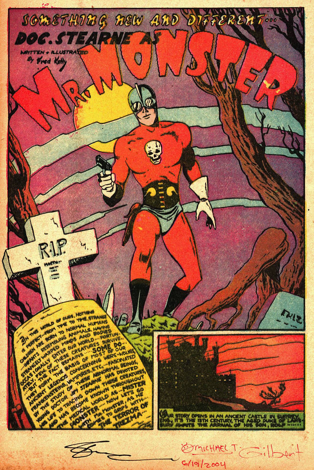
Thought you might enjoy the Mr Monster splash from inside the book.
- rjpb, pemart1966, Point Five and 1 other
-
3
-
 1
1
-
On 10/11/2023 at 12:29 PM, pemart1966 said:
This is a Canadian produced comic -
1. Are all of the characters in it "Canadian"?
2. Very curious that a Canadian comic would have the banner "America's Newest Sensation"
3. If the comic was produced in B & W why would any kid in the US buy it?
1. Yes - they all first appeared in Canadian whites published by Bell Features.
2. Super Duper 3 was sold into the States and targeted to Americans, hence the tag line 'America's newest sensation'. Note the date of the book as 1947. The war is over, US books are coming back into Canada. Bell Features didn't have much competition in Canada during the war due to import restrictions, but the competition has come back now in 1947. So from a business POV Bell has a problem and needs to figure out how he's going to operate in the new landscape. This book and a few others are a trial sale into the US (distributed by Howard on his behalf I guess) to see what the American response to the Canadian books would be. The stories are leftover inventory from Canadian whites stories. Despite the quality of the stories, it didn't work out. Bell ends up printing Canadian editions of US books in the post war landscape rather than trying to sell original material (see Marvel Tales published by Bell in 1950 below - many many other examples).
3. It was in color for that reason. Besides, the black and white books stop around 1946 just after the end of the war; this is 1947.
- pemart1966, Point Five and BEAUMONTS
-
3
-
On 10/11/2023 at 12:24 PM, pemart1966 said:
Or in this case "Black and White Hood"?
Red Hood = Batman
Black Hood = MLJ
Yup I noticed it too, just a typo I guess.
FEH did print MLJ stories in Canada, to your point.
-
On 10/10/2023 at 11:42 AM, pemart1966 said:
No British printed price doesn't surprise me - too expensive. Even a stamped British price doesn't surprise me given the point in history.
I am surprised by the fact that it was distributed to the UK. I would have thought that comic books would have been on the list of unnecessary imports.
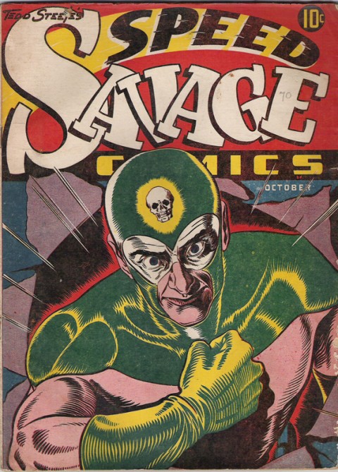
Stephen Lipson could speak to it better than I but I can tell you that towards the end of the 'Canadian whites' era (when import restrictions were about to be relaxed in Canada and were perhaps relaxed in the UK) some Cdn books were sold into the UK - that's fairly well documented. My favorite of these is the Speed Savage one-shot that had one cover for Canada and another for the UK. UK cover below. Note that even though this is understood to be the UK variant, the cover still does not have a pence price. Not sure why; maybe Stephen can chime in.
- BEAUMONTS, Darwination and Yorick
-
3


What are the top 5 Pedigree’s in your opinion?
in Golden Age Comic Books
Posted
Vancouver?