-
When you click on links to various merchants on this site and make a purchase, this can result in this site earning a commission. Affiliate programs and affiliations include, but are not limited to, the eBay Partner Network.


-
Posts
7,496 -
Joined
-
Last visited
Content Type
Forums
CGC Journals
Gallery
Events
Store
Posts posted by shrunkenhead
-
-
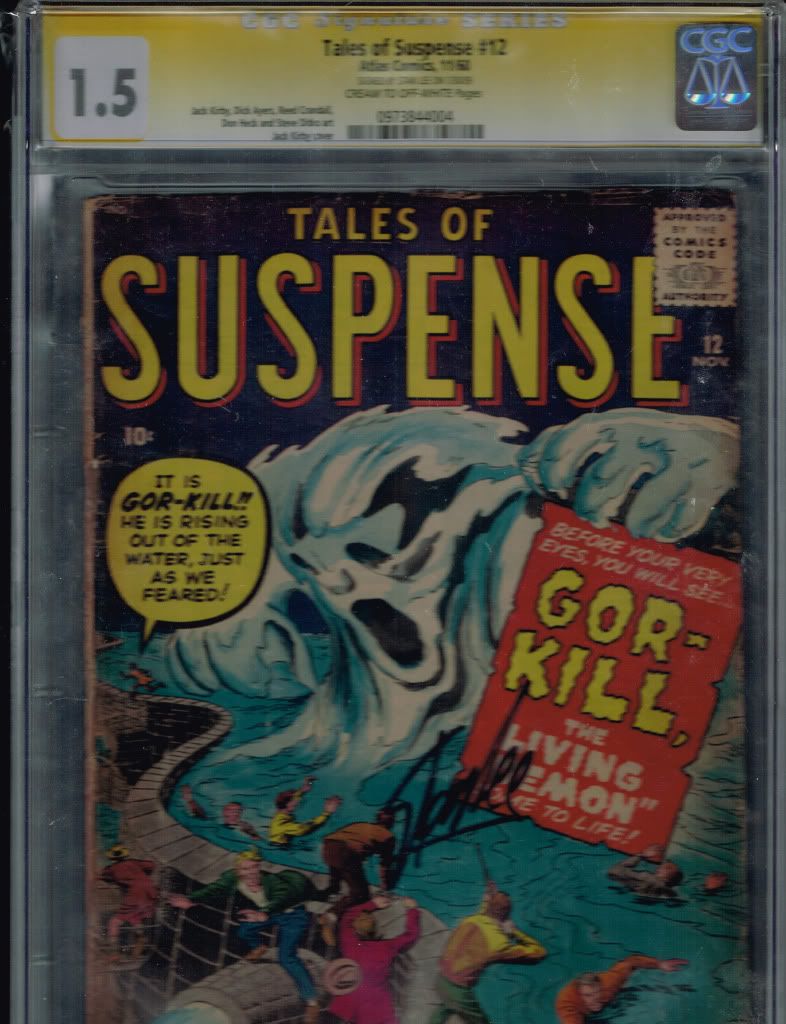
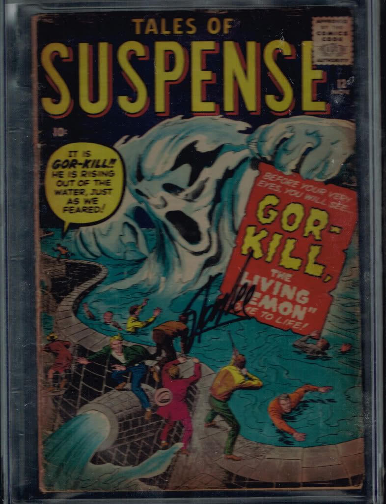
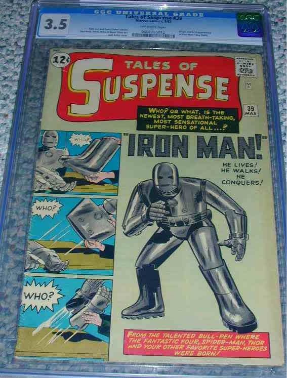
Tales of Suspense #12 CGC 1.5 ss series by Stan Lee think its the only one but could be wrong $80

-
-
Or non-ECs, for that matter?
-
Got nice lookin' Ditko?
-
Bring it again, chief. (thumbs u
-
Ain't that the truth!
-
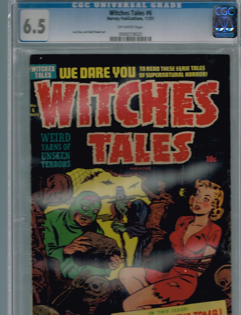
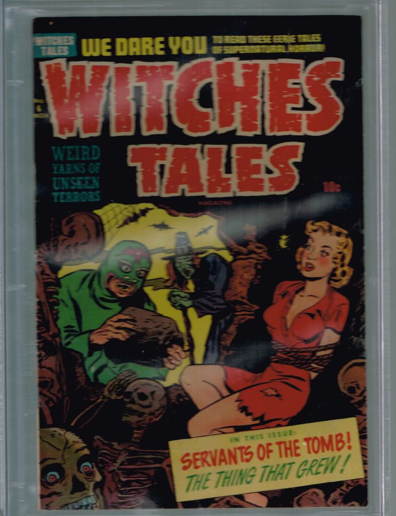
Tomb of Terror #6 cgc 6.5 off white pages $95
-
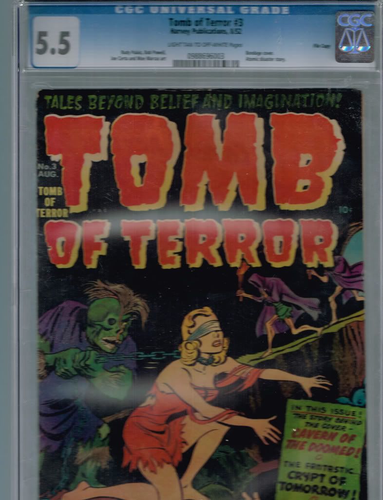
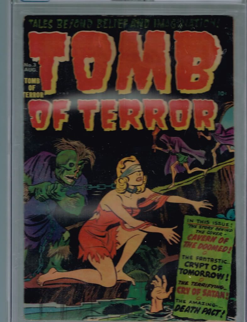
Tomb of Terror #3 cgc 5.5 Light tan to off white pgs. File copy $75
-
Unrestored, I'd guess that a 5.0 would bring in around 7k, give or take. Restored, I'm less sure...would depend on the amount of restoration, what type(s), etc. I'm guessing about 3500?
-
Sure is....but I like having a house to live in. Guess I'll stick with my measly 8 in VG+.

-
Long overdue kudos here for pickycollector. I bought a short stack of silver & bronze spideys...books were tightly graded, fairly priced, shipped fast, and packaged well. Awesomeness all 'round. I say we keep this guy!
-
Picked this up from Metro a fews years back---a grail book for me. Metro gave it a VG+, CGC gave it a VG-. I think it's solidly in the middle (the frayed spine looks much worse in the scan). This is in a slab these days, but this raw scan looks purtier.
-
Also, how come my avatar says I'm "offline?"
-
I'll cast a vote for less-than-wonderful asesthetics. The gray background seems too business-like to me. I feel like I'm visiting a work-related website, not something that is relevant to (for nearly all of us) a hobby.
I feel like the new look suggests an attempt to legitimize CGC's corporate brand for the non-comic book world ("hey, we're serious folk, no goofy graphics here"). But I have to wonder why that's necessary. I mean, there are plenty of bigger business enterprises out there with more colorful and less straightlaced-looking websites.
-
Yer all makin' me blush.


-
Even though the scan is blurry, that looks like a really nice 3.5. What damage does it have?
In addition to the tear near the price, there is about 1/2-inch tear on the back cover (at the top, close to the middle of the book). Not very noticeable, though. I imagine both those tears knocked the book down considearably grade-wise, yet the eye appeal is not really sacrificed as a result.
-
Here it is, my last big purchase of '05, and for awhile after that. It's back to the bargain bin for me for the next few months.

Sorry for the weird scan with the mattress background or whatever that is. This is the seller's original scan, and my scanner's kaput.
Pretty psyched about this one, as it's my first purchase of major Marvel key since I bought a Silver Surfer #1 about 13 years ago.
Book looks really nice for the grade. There is a tear at the 12-cent mark that probably knocks the grade down a notch or two. Still very nice eye appeal though.

-
Nice copy.
 I've thought about going for a Conan run...
  Want to finish the Iron Man run first, though, before I start anything new. Plus my Brave and the Bold run is a never-ending project.
-
FYI, Doug Sulipa's website is www.dougcomicworld.com
Thanks.
BTW - he was the only dealer who actually responded to my inquiry for an All Star #57. By all accounts a great guy.
So didja end up landing in AS#57? If so, who from?

-
I'm pretty sure the DC label is fairly explicit on most of their horror output, which would make sense given that their stuff was so much tamer than the work of their competitors. I mean, it's really not in the same category at all, so much of the DC pre-code is almost post-code in its refusal to delve into the deeply taboo stuff.
I seem to remember the DC logo being prominent on the early House of Mystery books. Can anybody confirm?
And I admit I dunno jack about romance comics, much to my chagrin.
-
Very nice pick-up, paull.
Love that cover...Marnin Rosenberg had a nice HG copy of that book awhile back (he might still have it, not sure) which tempted me though the pricetag was mighty resistant. Ya done good!
-
Very nice BTT#1!
 A very tough cover to find without a lot of yellowing, thanks to the all white background.
 Mind tellin' what it set ya back?

-
I got outbid on a VGF copy recently, the high bid being $250. So $180 for a decent VG seems reasonable...
$250 doesn't sound too bad... I was surprised that this book, with the cgc resto check and all, (I mean, this is not ewert-style territory, right?) did not climb a little higher.
Killer ditko cover on that sucker.
 I've yet to check the cgc census and gpa, but I shudder to think at what a VF or better copy would go for.
 -
Happy b-day!
Just won this on ebay.
 Didn't expect to win, but ain't complaining. Low grade, yes, but a book that I've wanted for a few years now. 1 and1/3x guide for a classic cover seemed reasonable to me. And once it arrives, the de-slabbing will commence.


Tons of pre-codes that need to go
in Golden/Silver/Bronze Age Only
Posted
That's a cool one! Thanks for putting it on the block. (thumbs u