-
When you click on links to various merchants on this site and make a purchase, this can result in this site earning a commission. Affiliate programs and affiliations include, but are not limited to, the eBay Partner Network.

Get Marwood & I
-
Posts
23,591 -
Joined
Content Type
Forums
CGC Journals
Gallery
Events
Store
Everything posted by Get Marwood & I
-
An anagram of 'Kevin Antrum's Dranzer thread' is 'Tarzan married seventh drunk'. Does that help?
-
You'd think CGC would want to solve the problem just to stop everyone going on about it. It's actually pretty tedious reading / hearing about it all the time now isn't it. Nice use of 'ameliorated' by the way
-
Go on
-

Ross Andru's Amazing Spider-Man Club
Get Marwood & I replied to Get Marwood & I's topic in Bronze Age Comic Books
There's a few of mine in the earlier thread posts Mark. I just had to have an Andru original, and ended up with 3. Bought at the right time Liz was preoccupied with the Molten Man as I recall. There's a clue on the cover of 173.... -
Doctor Tom Brent and His Flying Nurses
Get Marwood & I replied to Get Marwood & I's topic in Silver Age Comic Books
Good spot. It does look like that, yes. -
Doctor Tom Brent and His Flying Nurses
Get Marwood & I replied to Get Marwood & I's topic in Silver Age Comic Books
It looked like a copy of Donga. Sorry, Konga -
Doctor Tom Brent and His Flying Nurses
Get Marwood & I replied to Get Marwood & I's topic in Silver Age Comic Books
Cheers Gnash. I have watched that before, but it's nice to see it again. Amazing to think some of our old books came from there. Just a job for the workers I bet though. I wonder how many were smuggled home each night though. As for Charlton, I'm sure I read they self printed on a press that was designed for cereal boxes. Here's a comment from Wikipedia : Charlton was unique among comic book companies in that it controlled all areas of publishing - from editorial to printing to distribution - rather than working with outside printers and distributors as did most other publishers. It did so under one roof at its Derby headquarters. -
Ross Andru's Amazing Spider-Man Club
Get Marwood & I replied to Get Marwood & I's topic in Bronze Age Comic Books
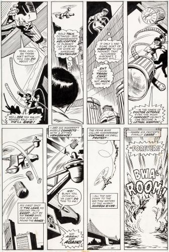
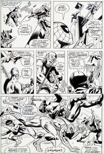
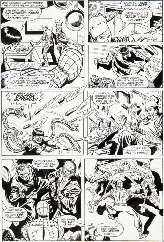
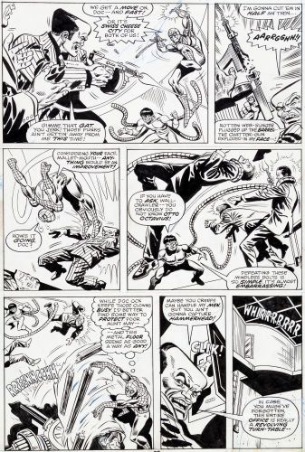
I used to keep a record of Andru ASM sales. Here's a few of the images I saved:


-
Ross Andru's Amazing Spider-Man Club
Get Marwood & I replied to Get Marwood & I's topic in Bronze Age Comic Books
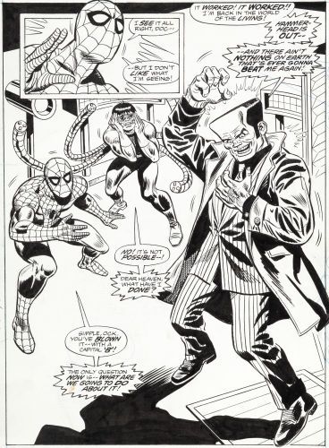
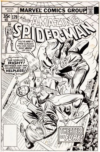
Not bad considering no Spidey or A list villain appears:

-
Looking at Kid Colt, the idea that the bold cents font means they'll be no pence copy is looking great for issues 90, 92, 93 and 94. That missing pence pattern matches other titles exactly by date incidentally. 91 and 96 have pence copies, and a different non-bold cents font. But, annoyingly, 95 sods it all up with a pence copy and a bold cents font presence:

-
Afternoon In my MPPV thread post here I speculate on the link between the font variations and the presence of pence printed copies: As I work further into the detail, each title seems to back up the theory that the presence of this 'bold fonted' US Cents price is a good indicator of whether a 9d pence price will exist or not. In the reverse, the absence of a pence copy indicates no US font variations. Here's RHK, sitting alongside the Patsy titles (NOPE means no pence edition found / known): I know for a fact that there are no 9d pence copies for RHK 18-20 as these are L Miller indicia variant books. Where the pence copy appears - number 17 (also a Miller indicia, see my Miller thread for the explanation) - there are multiple US fonts, including on this occasion the 'bold' one. It's funny how I have commenced separate research on Pence Books, L Miller Variants and Font Variants and then all three have crossed over together in this case. When I have completed the font spreadsheet for all the eligible 20 titles I'll summarise my thoughts and observations. There is at least one title which undermines the theories, unless of course the 'gap' means an as yet undiscovered pence copy. But my research has shown me that there are often anomalies which make no sense and disturb an otherwise soundly observed pattern. It could be though that I'll be able to state with close to near certainty which 9d priced books will never be found, if the patterns hold true throughout Additionally, it could help to explain why certain cents copies have the multiple fonts - maybe the bold font was run first, struck out for a 9d price run and then, for reasons unknown, a further run of cents copies were added. In the case of RHK, three changes were made during the run as four different fonts/prices exist. Speculating, maybe this happened: Bold US cents copies run off Pence plate added, then those copies run off Whoops! We didn't run enough cents. New plate added Damn, the price plate broke midway through. Add another One other explanation that makes sense - RHK 17 was so popular as a relaunch that a second and third print run was undertaken. But there is no evidence of this - the common view seems to be for the era that if anything, too many books were printed first time round. Or - the title was printed over different days. Or sites. Or both. If I had 100K comics to run off as a printer, would it always follow that they would be done on the same day? Half today, half tomorrow? But why a different price plate if so? It's got to be something to do with the pence books. Is there another explanation?


-
Marvel UK Price Variants
Get Marwood & I replied to Get Marwood & I's topic in Silver Age Comic Books
If you do read the font thread, tell me what you think of my theory here Gnash regarding the link to pence books - no one responded to it


-
Are Newton Rings 'normal and acceptable'?
Get Marwood & I replied to Get Marwood & I's topic in Comics General
Cheers Mark. I love all things comics, and am actually quite excited about getting my first books graded, even though it is just to facilitate selling them. All my slabs have been second hand to date. I won't chance it until I see that definitive statement though. 'Newton Rings have been consigned to history. Submit safe in the knowledge your slab will come back clean'. That's what I'm looking for. Sure they'll get there at some point Yes, that's how I interpreted it too. I don't think I've anything else to add to this debate now. There seems to be a multitude of explanations for the NR effect - I know which one I believe, based on my own experience coupled with logic. Lets hope we get something concrete from CGC soon on it's eventual elimination, and on the interim remedial process. I will post some fireworks if we hit 200 voters though -
 'The Last Mohican' would work wouldn't it, thinking about it. 40,000 Mohicans could be the 'Last of the...' if none followed them. I wish people would be more clear AJD What do you think they're saying to each other? Screaming out for a caption isn't it. "So it's just us left Dave. Me, you and Barry?" "No. There is another....."
 -
-
Marvel UK Price Variants
Get Marwood & I replied to Get Marwood & I's topic in Silver Age Comic Books
Here's one - I can't find the thread I was looking for - sure I posted in a RHK 17 Club at some point: -
Marvel UK Price Variants
Get Marwood & I replied to Get Marwood & I's topic in Silver Age Comic Books
WTFT? (Where's the font thread?). Have you got signatures turned on Gnash? If so, it's this one: Signatures can be quite informative and fun, and you can turn off individual members ones if you want. To turn them on, go to 'Forums', 'My Settings', 'Signature Settings' and toggle the 'View Signatures' button here to green: You have been a welcome visitor to my threads and I'm grateful for your input and interest. I wouldn't want you to miss anything cool that might interest you, so if you ever want to see what I or any other member has posted over the years, go to the members profile and to the right select 'See All Activity'. Then select 'Topics' from the right and you'll see a full list of every thread that person has ever posted: Here's the font variant thread here: I actually created two but the first got ruined when photobucket mucked up the photos. So I started again with direct posted images. There is another thread on RHK17 with additional input - I'll see if I can find it. Back shortly


-
Marvel UK Price Variants
Get Marwood & I replied to Get Marwood & I's topic in Silver Age Comic Books
Thanks Roy Cool. I've never used GPA - is it any good? -
 Now that's funny Gnash
 -
just make the shoulder larger and rounder and extending out from line of back. And the arse bigger.
-
Was it Humpty Dumpty?
-
Are Newton Rings 'normal and acceptable'?
Get Marwood & I replied to Get Marwood & I's topic in Comics General
@Mr.Mcknowitall @ADAMANTIUM Thanks for playing guys. Night! -
Are Newton Rings 'normal and acceptable'?
Get Marwood & I replied to Get Marwood & I's topic in Comics General
-
Are Newton Rings 'normal and acceptable'?
Get Marwood & I replied to Get Marwood & I's topic in Comics General
Hello. What do you want? -
Are Newton Rings 'normal and acceptable'?
Get Marwood & I replied to Get Marwood & I's topic in Comics General
I'm looking....it's ....hypnotic....drawing me in. ..... It's speaking to me..... saying....to me..........."you paid for this, you mug"


