-
When you click on links to various merchants on this site and make a purchase, this can result in this site earning a commission. Affiliate programs and affiliations include, but are not limited to, the eBay Partner Network.
-
Posts
4,290 -
Joined
-
Last visited
Content Type
Forums
CGC Journals
Gallery
Events
Store
Posts posted by jimbo_7071
-
-
-
- Popular Post
- Popular Post
-
-
-
-
-
-
On 4/2/2024 at 12:53 PM, Professor K said:
Mystery Men 10? Science Comics 4? Fantastic 6 or 7? Champion 8? 9? USA 3? Silver Streak 2 for cryin out loud?
A B is still a good grade, just not great. Mystery Men 10 is a good cover, but much of the credits goes to the colorist. The deep green on the bad guys makes the cover. Simon's line work could be better. Silver Streak 2, Science 4 and Fantastic 7 are pretty good.
The others you mentioned don't do much for me.
-
On 4/2/2024 at 12:00 PM, Mr.Fantastic said:
I have a Rangers on the way I think you'll like. I'll keep it a secret until it gets here.


-
On 4/1/2024 at 4:49 PM, bodhee11 said:
Amazing cover, insanely tough book in a great run, but by all metrics this price is high. But as they always say, only takes two committed bidders.
Yes, anything's possible with two stubborn bidders, and the book is scarce. I'm not wowed by that cover, though. It's just OK. (I'm not too crazy about Joe Simon's draftsmanship; I don't think there's any Joe Simon cover that I'd rate above a B.)
-
-
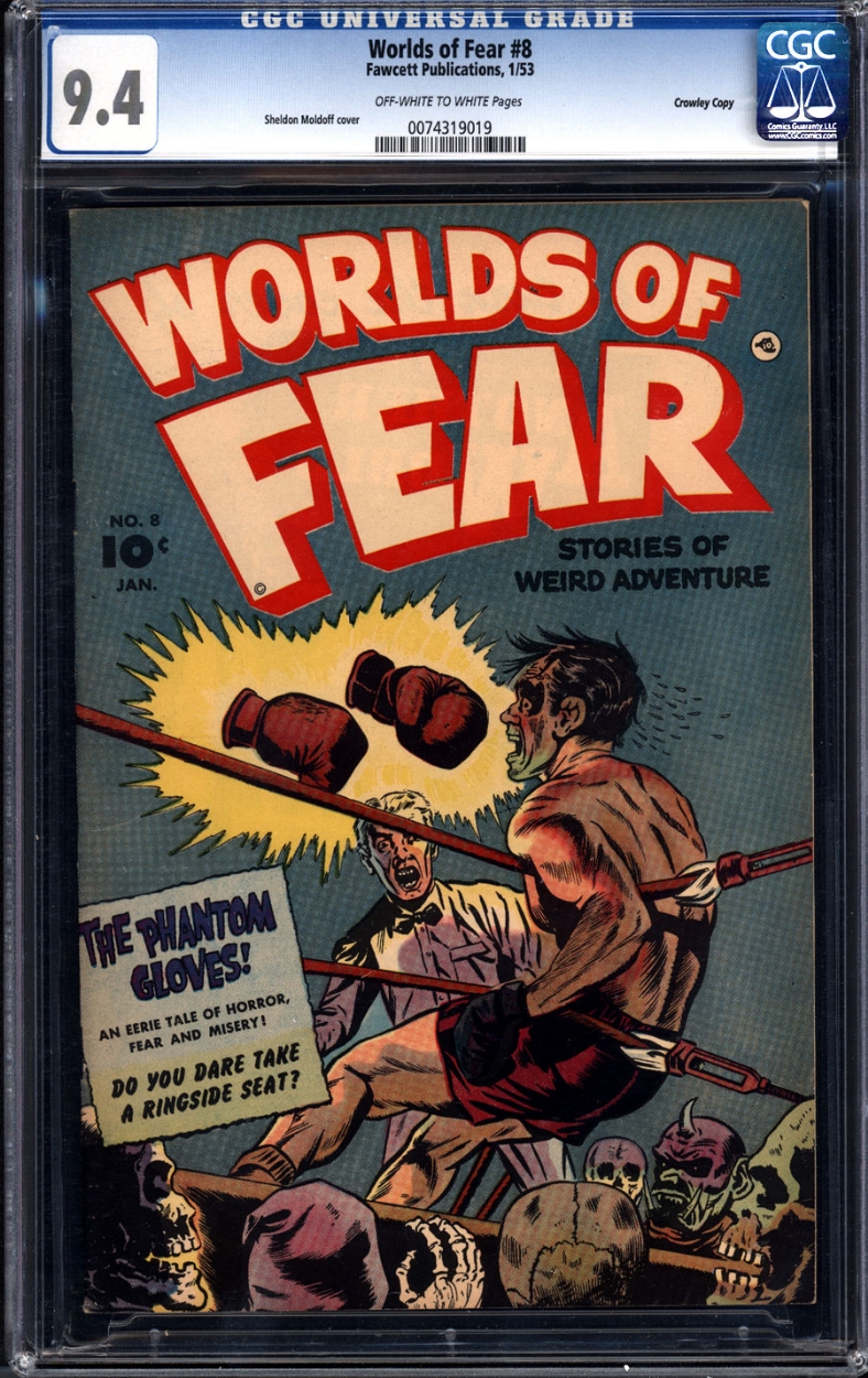
Topless male to topless male.
-
-
On 3/31/2024 at 9:13 PM, BLUECHIPCOLLECTIBLES said:
The ones in my post are from "No-Dot" copies. I don't know about the one that you posted. Some of the "Dot" copies have blurred edges, but none of the "No Dot" copies that I could find had clean edges. The "No-Dot" copies that I was able to find online all had blurred edges.
-
On 3/31/2024 at 5:54 PM, szav said:
. . . Tec 31, where most blue label copies that come up seem to always look like train wrecks.
Most guys hang onto their copies. Can you blame them?
It was high on my want list years ago, but I could never find a copy with nice pages, and I've long since been priced out of any copy that isn't a rag.
-
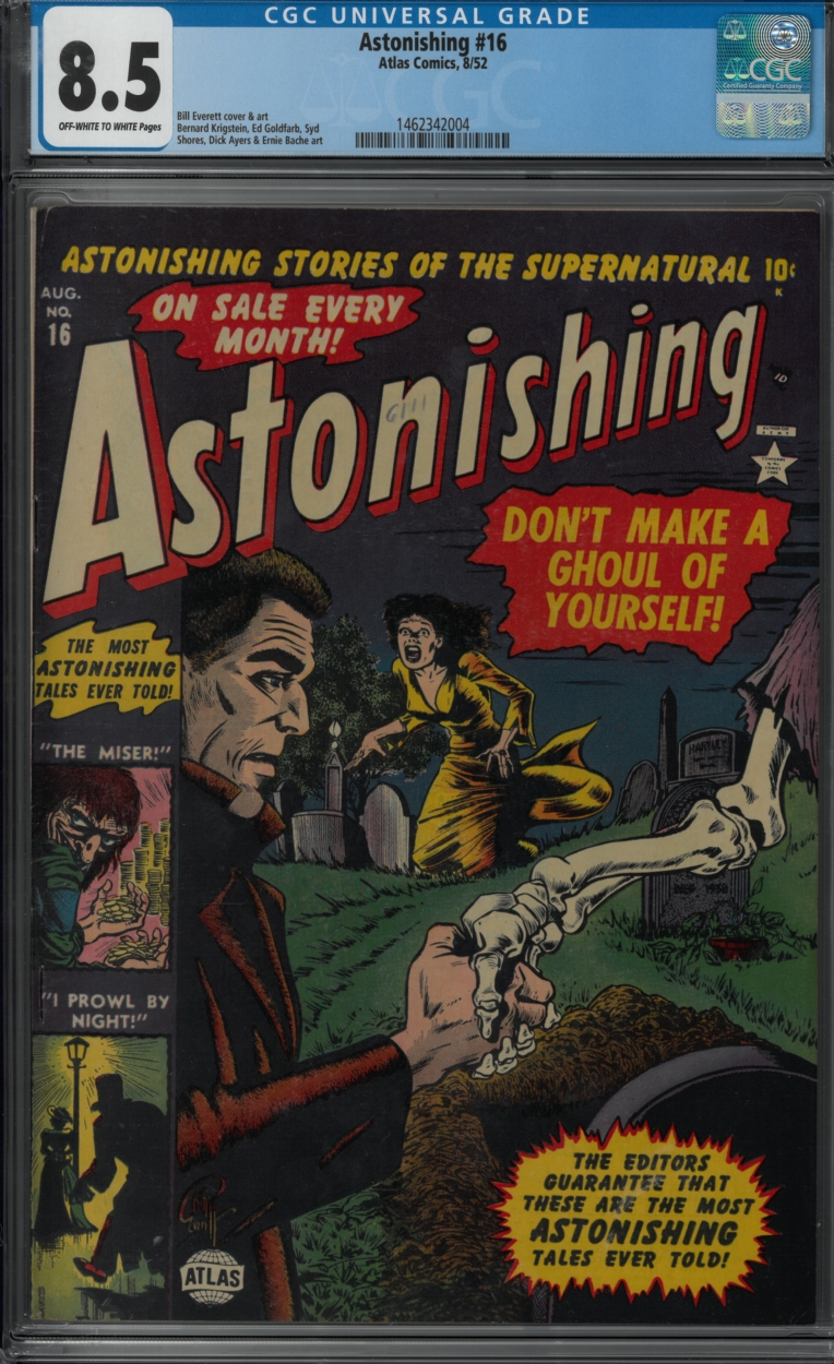
Astonishing to Astonishing.
-
On 3/31/2024 at 6:28 PM, Aman619 said:
Looking the new second set from with dot copies, the red is more fully inked. Printing solid where the no dot copes look muddled red, like a weaker transfer of ink.
if we have decided that the dot was printed for awhile and the presses stopped to file away the dot, then they ran off the rest of the run….
then the rough edges might be attributed to the plates sitting around for a “while” allowing the inks to dry a bit on the “mountaintops” then the presses start up again and new ink overlays on them, not clean metal with fresh ink, causing the edges to have extra outside the letter shapes AND cause the poor transfer making the exc text mottled red. But the red all over the covers would have the same roughness so we’d have to look over their entire covers
so basically, who knows as Lions den says b
I wish I knew how easy it would be for a feature like the dot to break off accidentally. I can envision a situation where the plates were removed from the press because the printers thought that the run was finished, and then maybe they realized that they goofed up and were 100,000 covers short—or maybe D.C. called in a last minute increase to the size of the order—or maybe some covers got ruined and they had to set everything back up to run more covers.
Any extra handling of the plates could have led to extra wear and tear, which could account for the missing dot and the ink bleed.
Maybe they ran part of the order on Friday, shut down for the weekend, cleaned the old, dried ink off of the plates before they started up again on Monday, and were a little too rough with their cleaning.
I have a hard time seeing them interrupt a print run just to address the issue with the dot on a 10-cent funny book.
-
On 3/31/2024 at 5:21 PM, Kevin76 said:
You don't wanna pay 20-30 to get in but it's ok to spend hundreds or thousands on a dealer's ware inside...?
Yes, that's right—just like I don't pay for admission to a store but might buy hundreds or thousands of dollars on purchases.
- jimjum12 and thewritestuff
-
 2
2
-
-
-
On 3/31/2024 at 11:01 AM, Aman619 said:
Sorry to disappoint, but no. I thought you were gonna ask an easy one, like why there is yellow around the black letters! Lions Den worked on presses and has more direct experience as to how ink behaves when transferred from the plates to the “blankets” to the paper.
OK. The reason I ask is that those 8 snips are all from "No-Dot" copies.
Any thoughts, @The Lions Den?
The copies with the dot all have much cleaner lines around the letters. (A couple of them have a tiny bit of red below the G, but less than what's seen on the "No-Dot" copies.) These snips are from the first 8 blue-label "Dot" copies that I found on HA. You can see how much cleaner the lines are. The last image is one that's closest to the "No-Dot" copies; I suspect that one was printed around the time in the print run when the plate changed.
- Paul Kosnik and Yorick
-
 2
2
-
On 3/29/2024 at 6:29 PM, Aman619 said:
Keep in mind that printing plates are like 3D topographical maps of an ocean with islands. Acid eats away the metal everywhere the artwork is blank/white on the artwork. Leaving scooped out areas and high points. The high points are like the islands — “mountains” attached to the ocean floor. Ink is applied to the plates and only sticks to the mountains. This ink is transferred to the paper.
I only mention this to suggest that you can’t “add the dot” to an existing plate and expect it to remain in place after a few impressions are made. So “adding a dot to the plate” isn’t a quick fix a printer would use.
Since you seem to know something about printing plates, I'll direct this question to you. Anyone else who is familiar with printing should feel free to chime in.
Take a look at these 8 snips from Batman 1s. Do you see how the red along the bottom of the G in "SPRING" looks a bit blurry? (You can see a similar characteristic on other letters, too, such as on the bottom of the S in "SPRING.") Do you know what could cause that? Could it be from burrs on the plate early in the print run? Could it from wear to the plate or buildup late in the print run?
-
On 3/20/2024 at 4:22 PM, TerrysComics said:
With a very large Guest list , I understand the need to raise the admission price, Guests can be a very large of a Promoters Budget.
Guests are the reason I stopped going to comic shows. I do no want to pay $20 or $30 to be able to see dealers' wares just because there are guests. To me that's like paying admission to go to the store. I couldn't care less about the guests. Maybe these shows could have a shopping-only admission price and a separate, higher price for people who want to have access to the guests.
- Ryan., thewritestuff and jimjum12
-
 3
3
-
- Popular Post
- Popular Post
On 3/30/2024 at 11:45 PM, tth2 said:Anyone know what the asking price was?
I think it was offered as payment to anyone who would rub out a certain former associate who defected to the competition.
- batman_fan, Point Five, tth2 and 2 others
-
 5
5


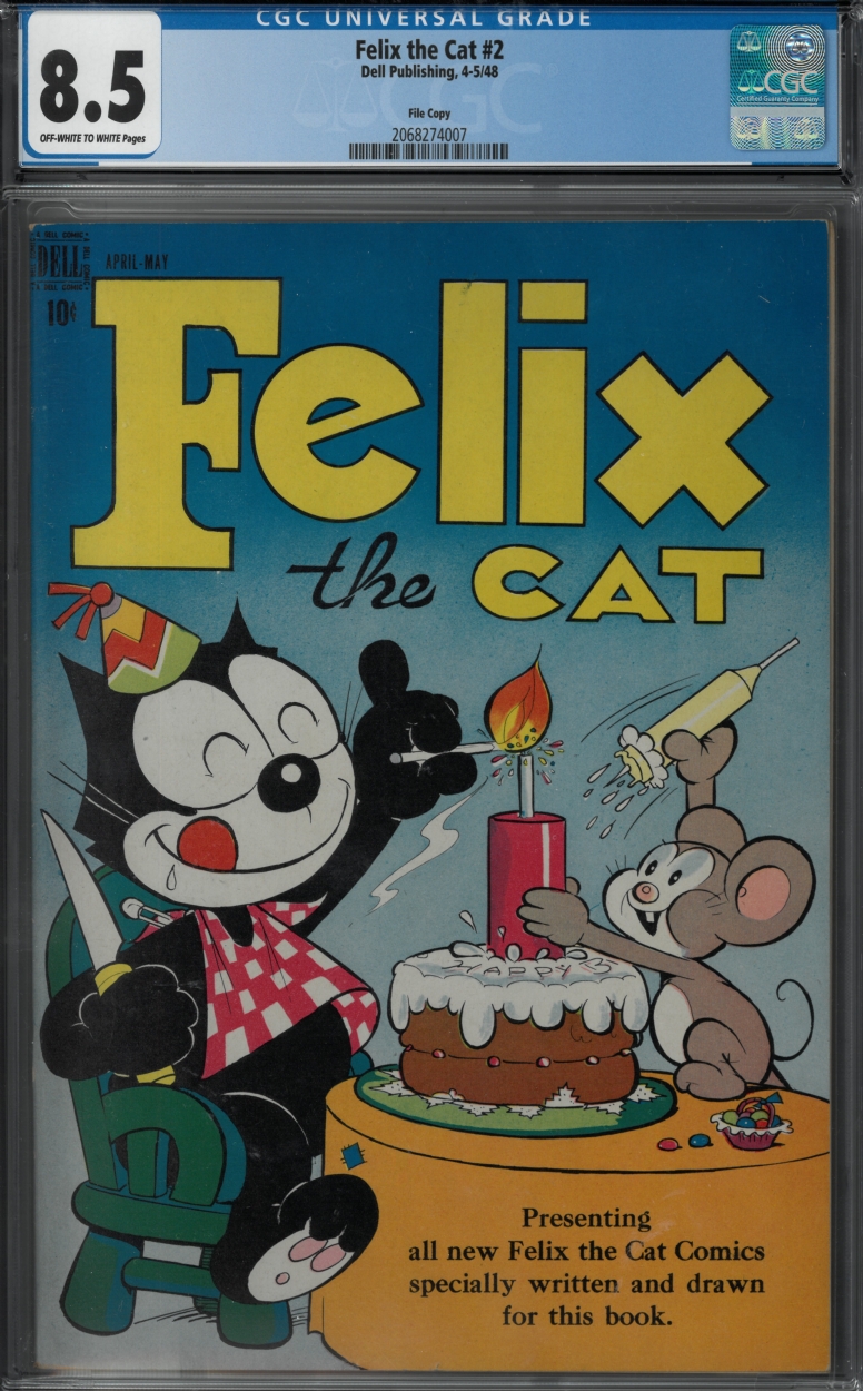


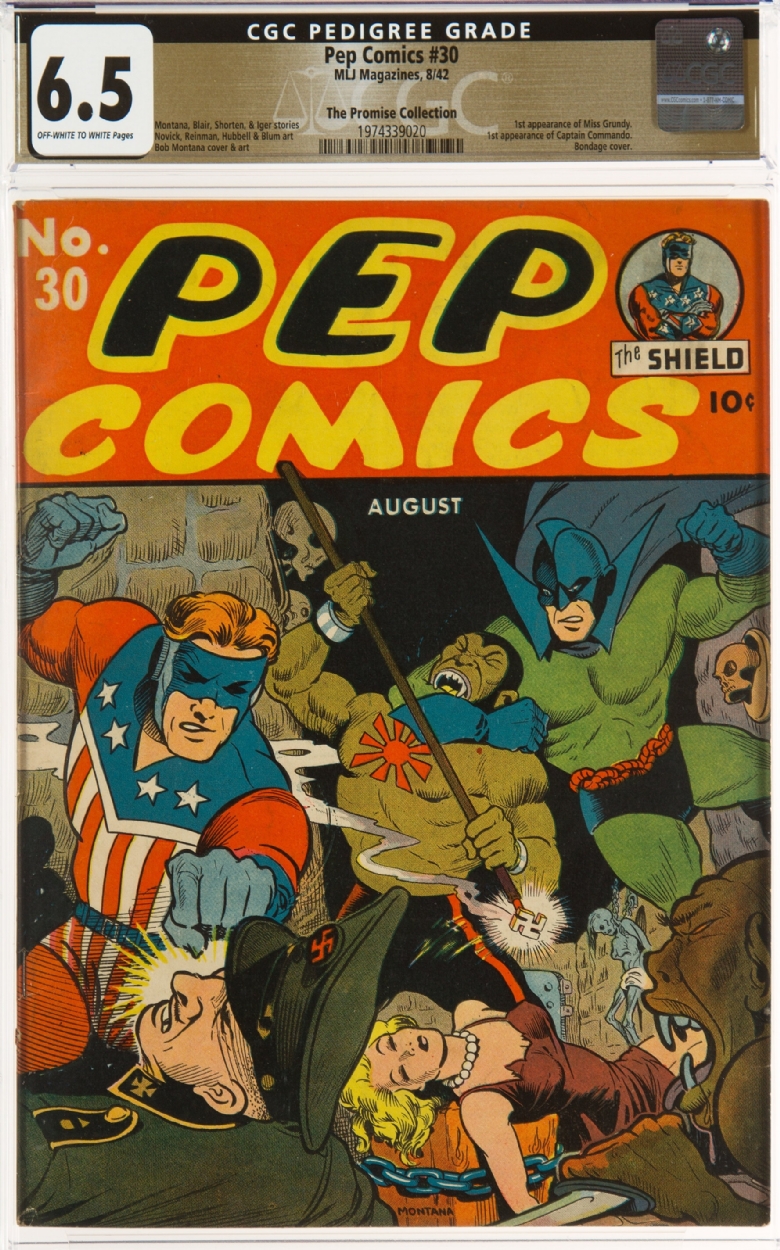
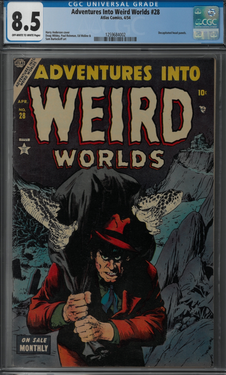

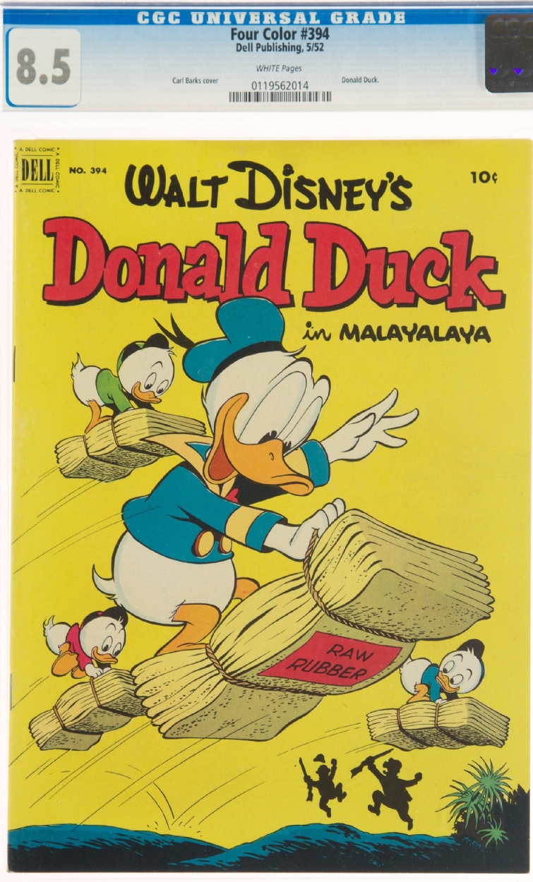


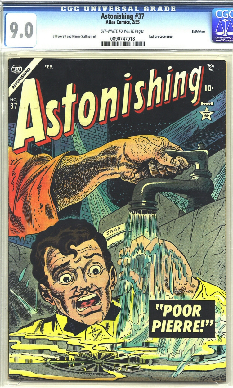


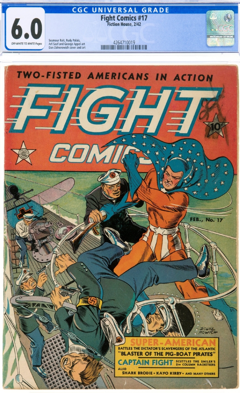


GOLD CONNECTIONS
in Golden Age Comic Books
Posted
Real Secrets to Strange Secret.