-
When you click on links to various merchants on this site and make a purchase, this can result in this site earning a commission. Affiliate programs and affiliations include, but are not limited to, the eBay Partner Network.


-
Posts
140 -
Joined
Content Type
Forums
CGC Journals
Gallery
Events
Store
Posts posted by kent allard
-
-
On 8/21/2024 at 8:25 AM, Robot Man said:
I listened to Steve Carson and joined up. Have you?

@Robot Man, this is the kind of stuff that makes you a *LEGEND* here.
Do you still own your soul? (You know, after that YouTube clip you responded with in the other thread, I'm beginning to wonder nowj/k of course )
)
-
On 8/21/2024 at 3:57 PM, gunsmokin said:
Some Sandman/Fless momentos of mine.


Truly awesome ...
")
-
On 8/21/2024 at 5:31 PM, Point Five said:
OK, I do have a few of these bad boys.


The Speed digests got me interested in the Pocket digests, but they are too expensive to just 'collect, because'.
Your #1 has gone up quite a bit since 2008
 . Having started my collecting in the early 70's (OPG #4 & 5 ), then going AWOL after the 70's until 2019, there is has been serious cognitive dissonance when looking at prices today. I lament not having restarted collecting earlier, as so many of the things I would have liked to own are now seriously out of reach. I am so envious of you 'old-timers' that were wise enough to continuously collect and effectively 'dollar cost average' your collection. It's been financially challenging to play catch up on 40 years of inattention. Sort of like trying to begin funding your IRA at age 62
 ") .
.
How long have you had the #2?
-
- Popular Post
Thanks for bumping this thread.
Here's my modest contribution to the thread ...
This one is shamed by the gorgeous one @CentaurMan posted on Page 8 ... but it's mine, mine, mine (down,down,down - for those that get the reference
 ) mooahahahaha!!!

Nice grade, but overpaid. Not even sure why I bought it. Don't really care that much for the cover, but got blinded by the idea of having a high grade Starman and got caught up in the moment
")

Modest spine roll; worse, there seems to be small amounts of rust near the staples.

- Yorick, adamstrange, tth2 and 3 others
-
 6
6
-
OK, I just want to comment on @BLUECHIPCOLLECTIBLES's great contributions and how I see them fitting into my intended criteria.
The AAF #2 is an abstract whimsical idea that captures how we think about Japan. It transcends just a dramatic situation that shows patriotic feelings, and makes a statement. I love it, but I don't know if I would consider it iconic, because I'm not sure how strongly it resonates with people. Unlike the CM Jr #9 which immediately invokes a strong feeling of patriotic strength and resolve. Just excellent!
The Sensation #13 is cute, can be considered symbolic and iconic, but is not that original. Doesn't work that well for me. The CM Jr #13 is a variant, but much stronger in my opinion. I can see this being on someone's top ten. The Sensation? I would be surprised.
The Headline? Another strong contender. Simple; direct; powerful imagery.

The Blue Circle? Cute. Not so memorable to me. I would struggle to consider it iconic.
That brings me to the Mystic. Checks the symbolic box with the unleashing of demons on a hapless victim. I can see it being iconic too, but I just have a hard time putting up there next to the CM Jr #9 or even #13. Why? To me, an iconic cover should immediately convey a gut-level message, and the symbolism aspect makes it not just dramatic, but a conceptual statement. The CMs accomplish that. For the Mystic I need to think too much to get what the message of the artist is. Is this just a neat dramatic cover to sell copy? Or is the cover the medium by which a bigger issue is being addressed, and also sells copy? By that criteria, I believe Captain America #46 deserves a place at the table. It is dramatic/horrific for sure, but I believe Schomburg was trying to make a very powerful statement about Nazism, not just sell copy.
Anyway, this has been a long explication to try to tighten the submissions to the best of the best. I was hoping to avoid just another neat WWII cover thread, of which there are already many.
Back to you guys (and gals, wherever you may be)
-
On 8/21/2024 at 11:07 AM, BLUECHIPCOLLECTIBLES said:


Those all fill the bill! (except the Bogart cover
") )
)
Nice!
I *really* like that CM Jr #9. Beautiful, clean composition. Moves into my top 10!
-
On 8/21/2024 at 11:08 AM, 143ksk said:
The threat to liberty by Nazi Germany?
Sure, if it works for you
Doesn't ring my chimes
-
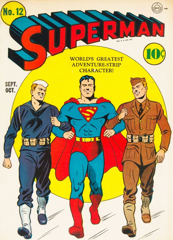
On 8/21/2024 at 8:40 AM, Limited66 said:
This my favorite Supes of the period and the lightly outlined tanks and artillery in the background seem symbolic to me of American mobilization after Pearl Harbor the month before

Wow! I never noticed the tanks in the background till you pointed it out.
This is certainly an iconic cover.
-
On 8/21/2024 at 4:18 AM, 143ksk said:

I like this one *much* better!
-
On 8/21/2024 at 4:18 AM, 143ksk said:
Pep 20 is my all time favorite WW2 cover. I also love Pep 23.

Cool cover, but not sure what it's symbolizing.
-
On 8/20/2024 at 6:51 PM, sfcityduck said:
But, if you want trippy (definitely not mine), the anti-Hitler covers may work for you:
These go on and on. Something that's not a comic but fits the genre and the characters (I sold this one and have a much better looking copy):

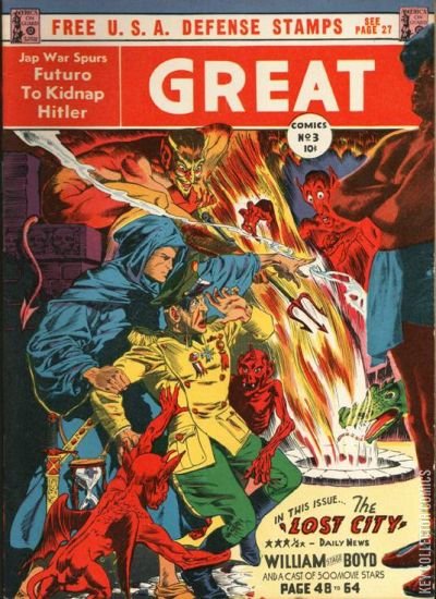
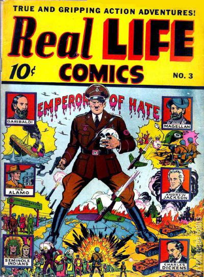
Wow! All strong candidates. I'd forgotten about the Real Life.#3. I personally think it trumps the All Winners #8.
-
On 8/20/2024 at 6:16 PM, jimbo_7071 said:
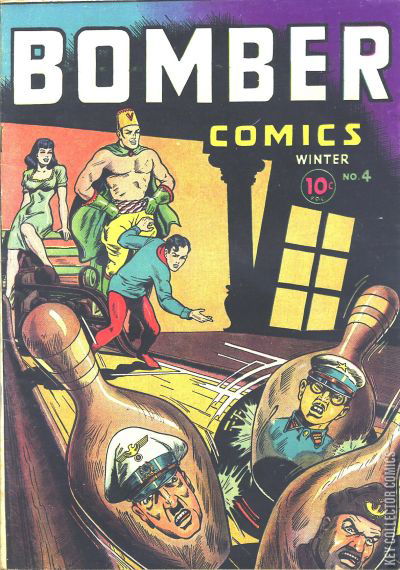
I see this cover as symbolic. It shows a puppet Anerican soldier battling a puppet Japanese soldier along with other puppet characters from the stories.
It shows that soldiers are regular people who are essentially powerless—manipulated by governments and other forces beyond their control.
The way the puppetmasters are grinning shows that the trials and tribulations of these regular people are of no import compared to the capricious whims of the powers that be.
It's a neat cover, and I like your interpretation, but I can't see it as iconic. You need to think too deeply
. A 13 year old should be able to 'get it' immediately for it to be iconic.
-
On 8/20/2024 at 6:15 PM, Robot Man said:
Are we talking “iconic” or ”symbolic”? Iconic opens up a whole new can of worms…
Up to you guys (and gals, if there are any out there
)
I'm thinking primarily symbolic, that have become iconic. There is lots of symbolism in covers, and there are lots of iconic covers. We could get swamped unless we tighten the criteria. I admit, Cap #46 doesn't belong in the group. I recant

-
- Popular Post
- Popular Post
I can't believe I haven't posted this one yet. In my opinion one of *the* most powerful iconic covers of the era, but in a subdued way. Not over the top, just powerful! The jet and the bi-plane, straddling WWI and WWII. Just wow! Can't see this enough times

- thehumantorch, IngelsFan, sagii and 2 others
-
5
-
On 8/20/2024 at 6:09 PM, Robot Man said:
I thought about posting my copies of this as well as Exciting 49 (poison candy). But, I felt they were actually more “horrific” than symbolic…
I agree. I vacillated over including Cap 46, but it is just so powerful an image that I couldn't resist.
I also considered Thrilling #41, but while that's a humorous cover, I don't consider it iconic.
-
On 8/20/2024 at 6:03 PM, Robot Man said:

Cute, but not exactly what I would consider iconic
-
On 8/20/2024 at 6:01 PM, Robot Man said:

YES!
I've got this one, but no image of it. Glad you posted one!
-
On 8/20/2024 at 5:51 PM, Robot Man said:

Nice!
-
I'm just the guy that started the topic, I don't own it.
On 8/20/2024 at 3:14 PM, sfcityduck said:Love those patriotic covers, but not sure they are all "symbolic" or the symbolism is pretty obvious. A popular image in a war that was being fought as much on the homefront (production was key) as on the battlefield was the notion that folks back home were walking "arm in arm" with the soldiers. It was symbolic of national unity and sacrafice in support of the war. Lots of examples in comics but these were the easy images (not mine) for me to find:


The war bonds and victory garden covers are another riff on this theme.
Great point @sfcityduck. There is a difference between a patriotic cover, and a iconic cover that symbolizes something.
I don't own this thread, I just started it, but I feel that including patriotic covers like these broaden the scope too much. My idea was more along the lines of abstract conceptual covers that are more fantastic, then prosaic patriotic ones.
Again, I am not the judge of right and wrong here, but @AJD, @IngelsFan, @Robot Man and @buttock have good example of what I think of as a surreal image with an underlying symbolic message. For me, @buttock's National covers tend to be simply patriotic except for #21, with honorable mentions for #33 and #41.
Admittedly, my beloved Speed #26 does not contain any surreal imagery, but it seems to make such a powerful, assertive message that I love it. I would prefer to see covers that are taking the fight to the enemy, than showing us as being strong in defense of the country.
I'll throw a curve ball into the discussion by introducing Captain America #46 for consideration. Not surreal (unfortunately all too real), but powerful and iconic.

This is getting interesting. Keep 'em coming ...
-
On 8/20/2024 at 2:23 PM, Frisco Larson said:
Wow, that's incredibly kind of you to say, I'm very humbled by that. Thank you so much!
Please! Any one who has followed your posts can see for themselves that you are a 'real' collector of discriminating tastes. (I hope that doesn't sound sycophantic
)
-
On 8/20/2024 at 1:53 PM, Frisco Larson said:
WOW!!!! What a fantastic stack of Speed issues you've put together!!! These are generally VERY expensive right now and HAVE been for the last several years!!! I've had very little luck adding any to my collection. Well done Sir!!!

Oh me, oh my, yes. They have certainly sucked up a *HUGE* part of my collecting budget. They have been in the 1K range, which isn't cheap, but hey, a lot cheaper than trying to collect Mystery Men or Wonderworld!
Thanks! Praise from you is not taken lightly dear sir!
- Frisco Larson and Point Five
-
1
-
 1
1
-
On 8/20/2024 at 8:34 AM, buttock said:
It's pretty great. The symbolism is among the best of WWII. Up there with Zip 22, Pep 20, and a small handful of others.
Your post got me thinking - what a great topic for a thread. And here it is ...
-
- Popular Post
- Popular Post
Over in my other thread (https://boards.cgccomics.com/topic/537990-show-some-love-for-speed-comics/page/2/#comments), I expressed my profound love for the cover of my copy of Speed Comics #26 and the symbolism it expressed.
@buttock agreed, and mentioned two other uber-iconic covers: Zip 22 and Pep 20.
That got me thinking this would be a good topic. Let's take a poll - what are your favorite *symbolic* covers from the WWII era. This is not for *neat* covers - that is a bottomless well - I mean symbolic covers.
Here's my Speed 26

I consider this iconic.
This one may be neat, and WWII-related, but I wouldn't consider it iconic

Whereas this one *is* iconic, but in my opinion not as good as #26 (hat tip to @AJD, beautiful copy by the way
)

OK, over to you all. What are your favorites?
- AJD, sfcityduck, Tri-Color Brian and 2 others
-
4
-
1
-
On 8/20/2024 at 9:17 AM, MrBedrock said:
Unfortunately I don't have any Speed Comics at all.
Now that caught me flat-footed.
I thought you had *everything*, and in 8.0+ to boot! And I say that in the most respectful manner.
The things I have seen you share often leave me dumbfounded.
- MrBedrock and Point Five
-
1
-
1


 ) mooahahahaha!!!


Best symbolism in a WWII cover
in Golden Age Comic Books
Posted
This #17 and #26 both qualify in my mind.
What I find interesting is the coloring/inking. Clearly the same image, but check out the package. In the original, the crotch area is subdued because of the dark hatching. In the Brazilian one, there is a suggestive bulge. Was this in the original, but covered by the inking which they dialed back on so it became noticeable? Or, were there actual changes made to the image? Notice the position of Hirohito's right foot in the two images. Also, Hitler's medal has moved from outside the cape, between Hitler's legs, to inside the cape. The missing action lines under Hitler's cap is trivial to explain away.
Is this a well-executed recreation? A cut /paste job? Any ideas?